Forty Nine Interiors
featured
The Client
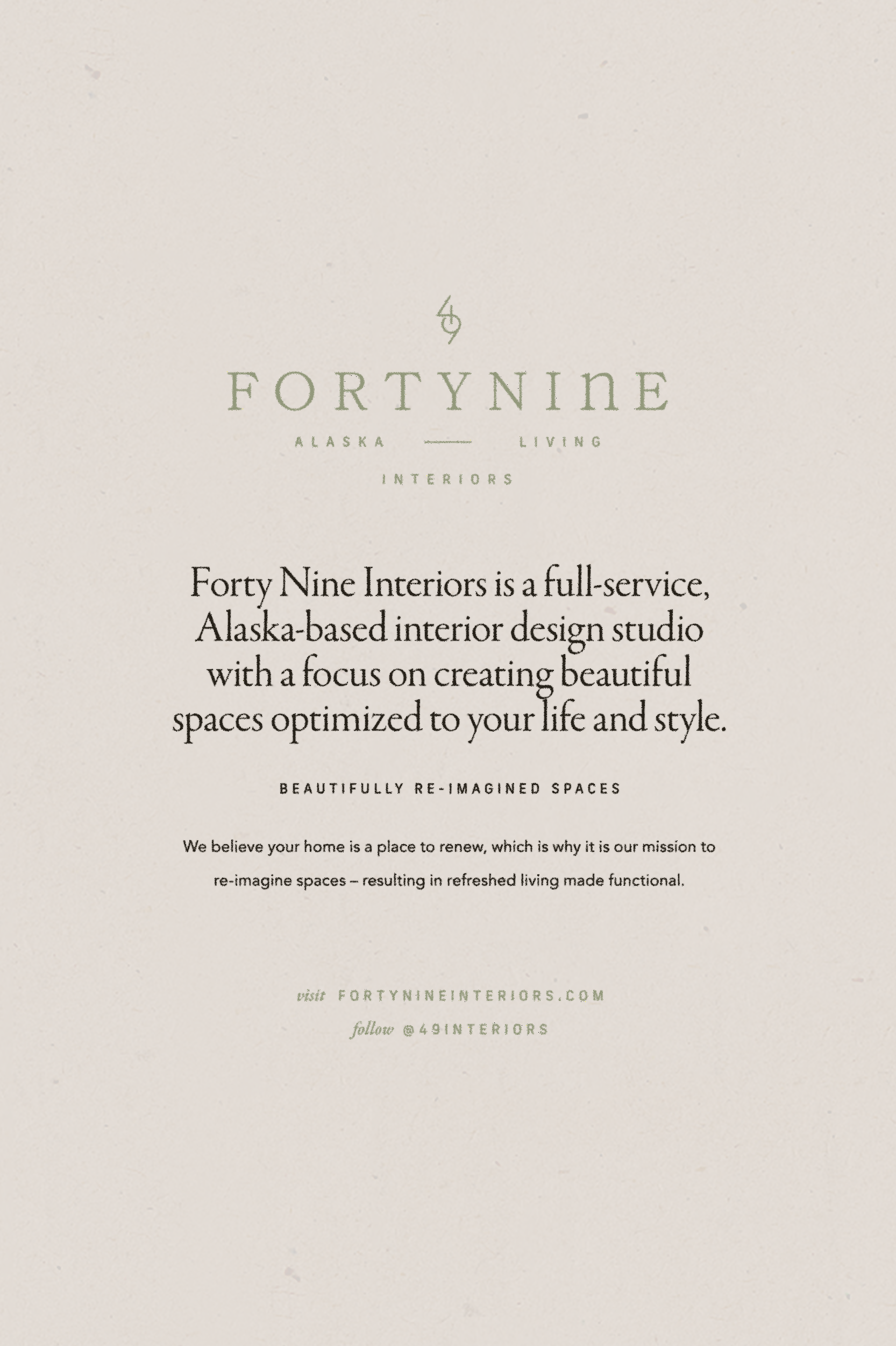
Forty Nine Interiors is a full-service, Alaska-based interior design studio with a focus on creating beautiful spaces optimized to their client’s life and style. They believe a home is a place to renew, which is why it is their mission to re-imagine spaces – resulting in refreshed living made functional.
The Brief
Create a brand identity that compliments their elevated yet comfortable design style while embodying their uplifting, playful personality.
Their name, Forty Nine Interiors, is a nod to founder Beth’s home state of Alaska, the 49th state, where she was born, raised, and now operates her studio.
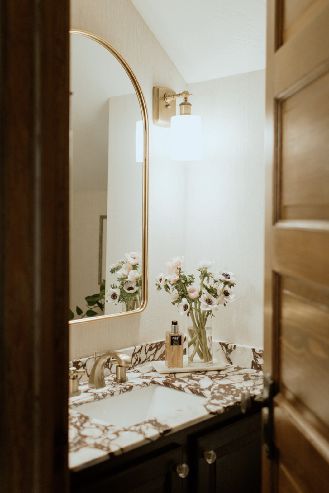
With an approach Beth describes as spaces made beautiful and functional – Forty Nine Interiors’ style is eclectic, fresh, and comfortable – oftentimes bringing influences of Alaska’s unique landscape and natural beauty into the home.
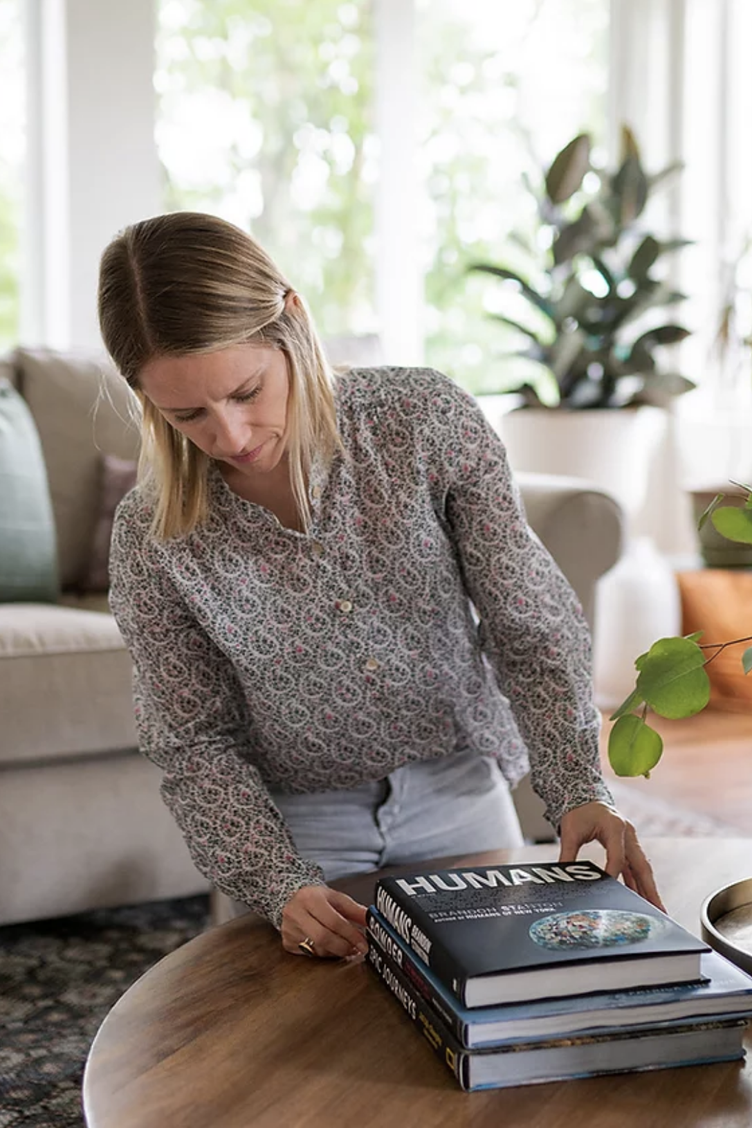
With renovations at the heart of their business, Forty Nine Interiors’ love for problem solving paired with their artistic eye lends to beautifully re-imagined spaces that make each client feel refreshed.
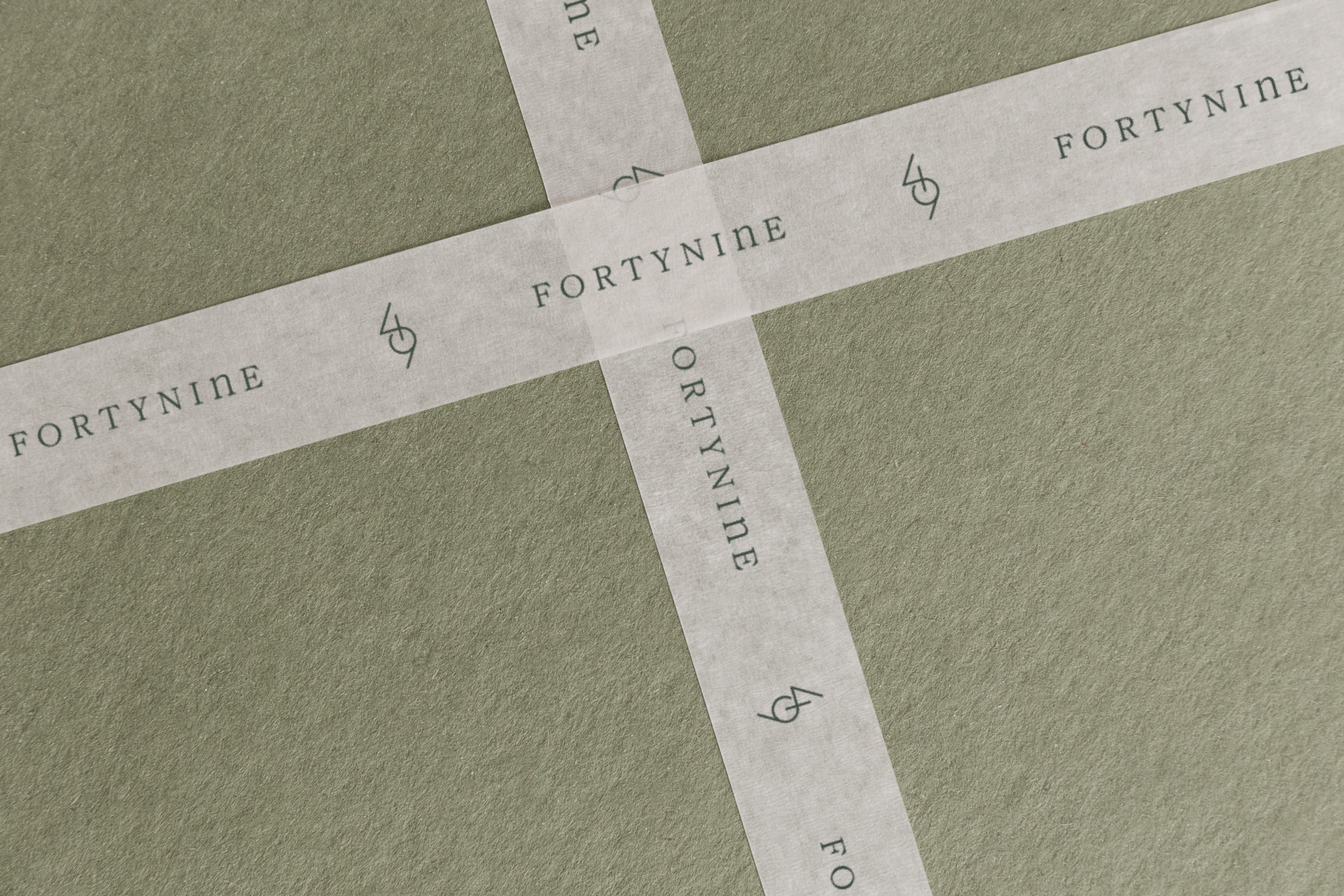
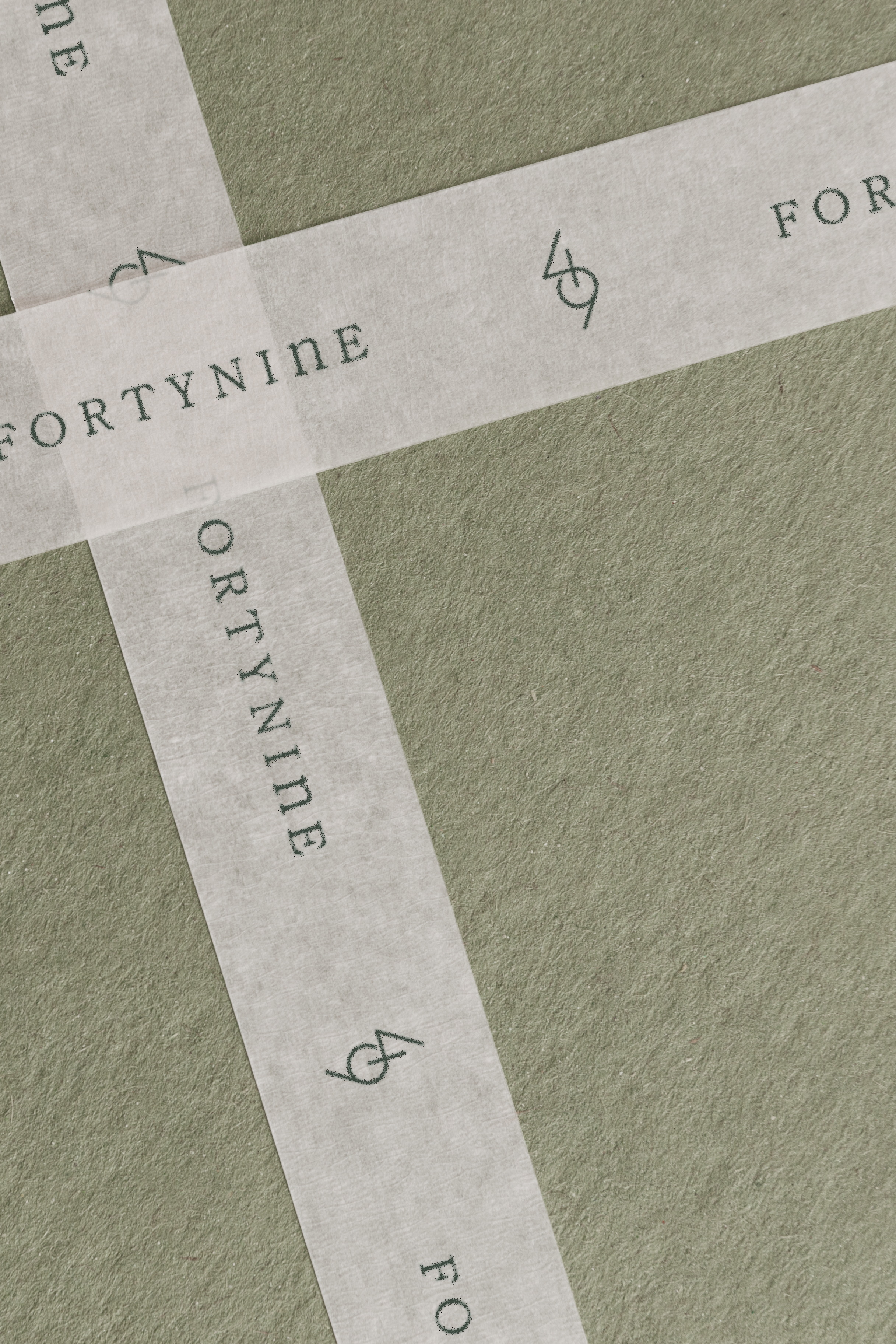
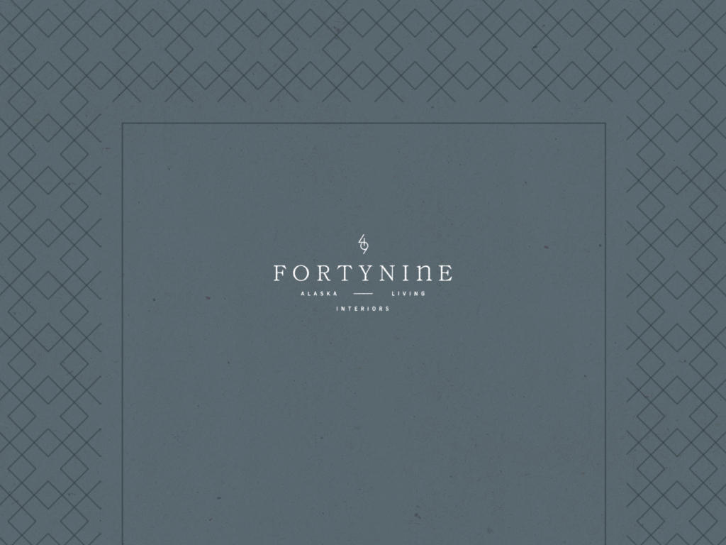
To signify the idea of bringing new life to spaces and creating refreshing atmospheres, we merged their numerical name while incorporating parallel diagonals lines that create a sense of directional flow – creating a subtle, stylistic refresh symbol.
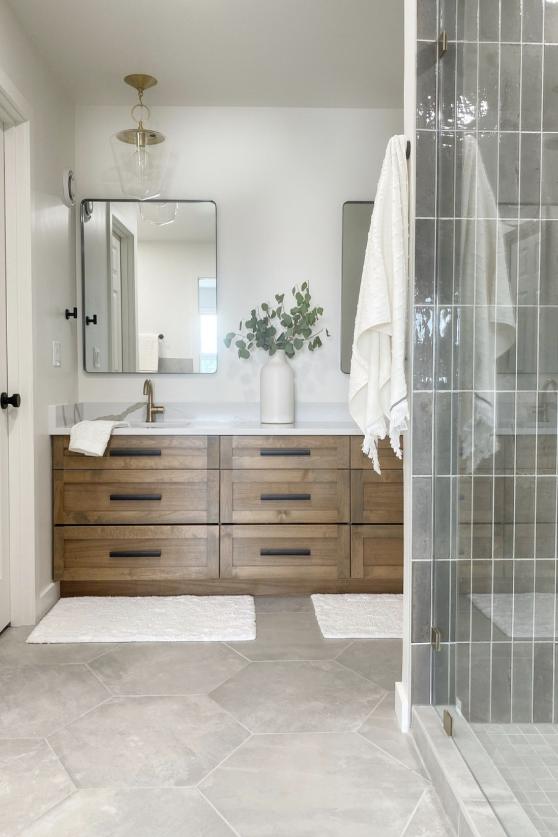
Through clean linework, eclectic typography, classic pattern work, and a welcoming color palette inspired by Alaskan landscapes, we were able to reflect Forty Nine’s unique style and approach – creating a visual identity that feels uplifting with an approachable sense of luxury.
With efficiency being a large part of their design solutions and customer experience alike, we incorporated geometric-based and simplistic linework throughout the iconography and supporting design elements to evoke a clean sense of function and organization.
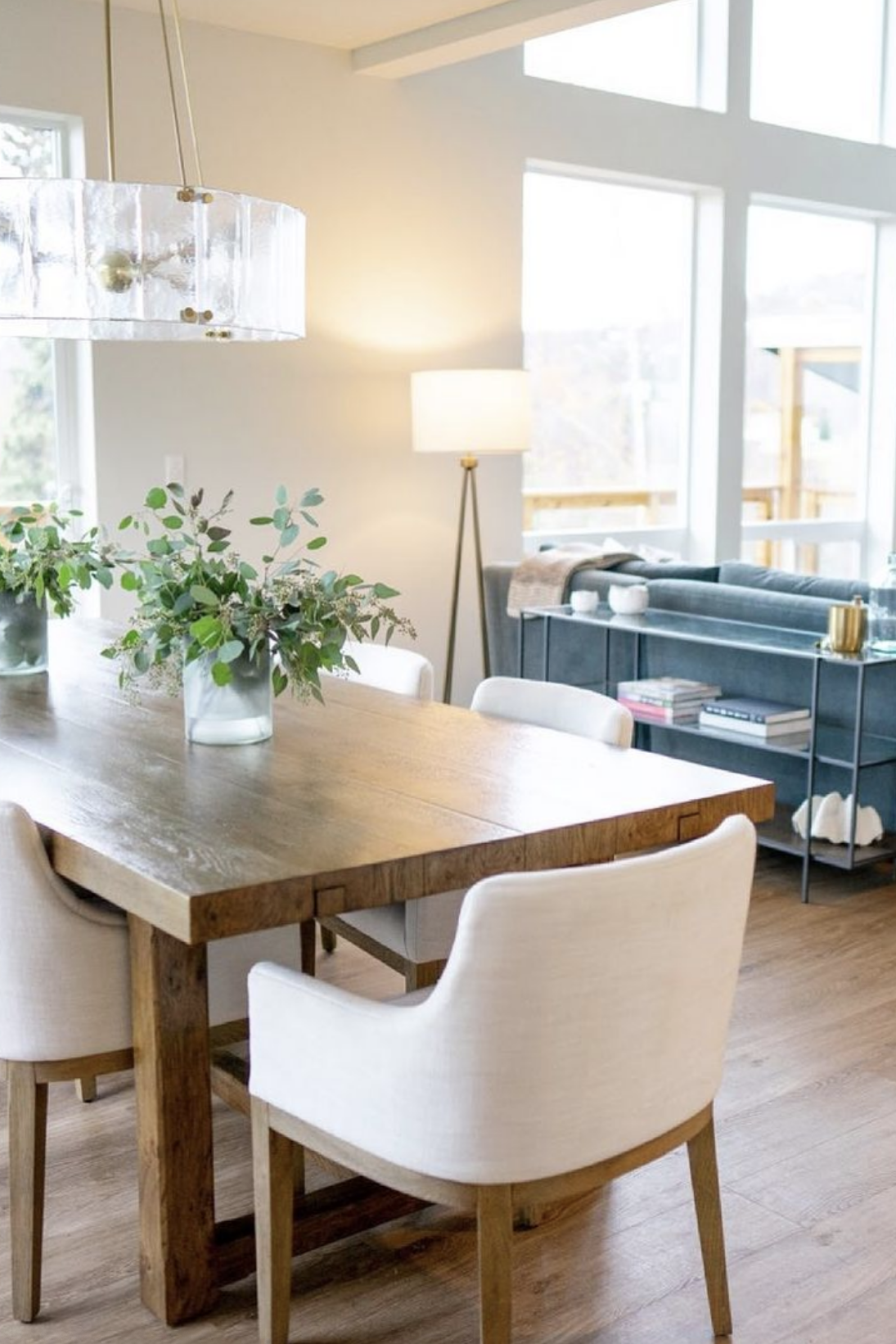
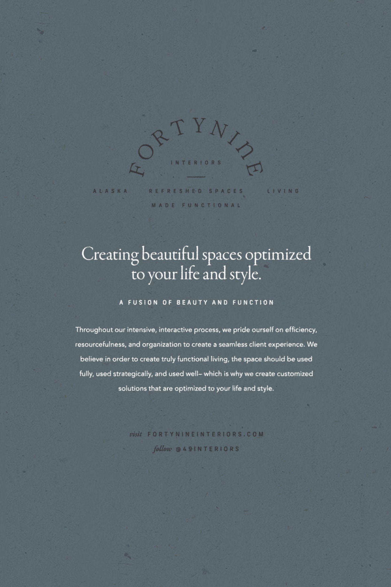
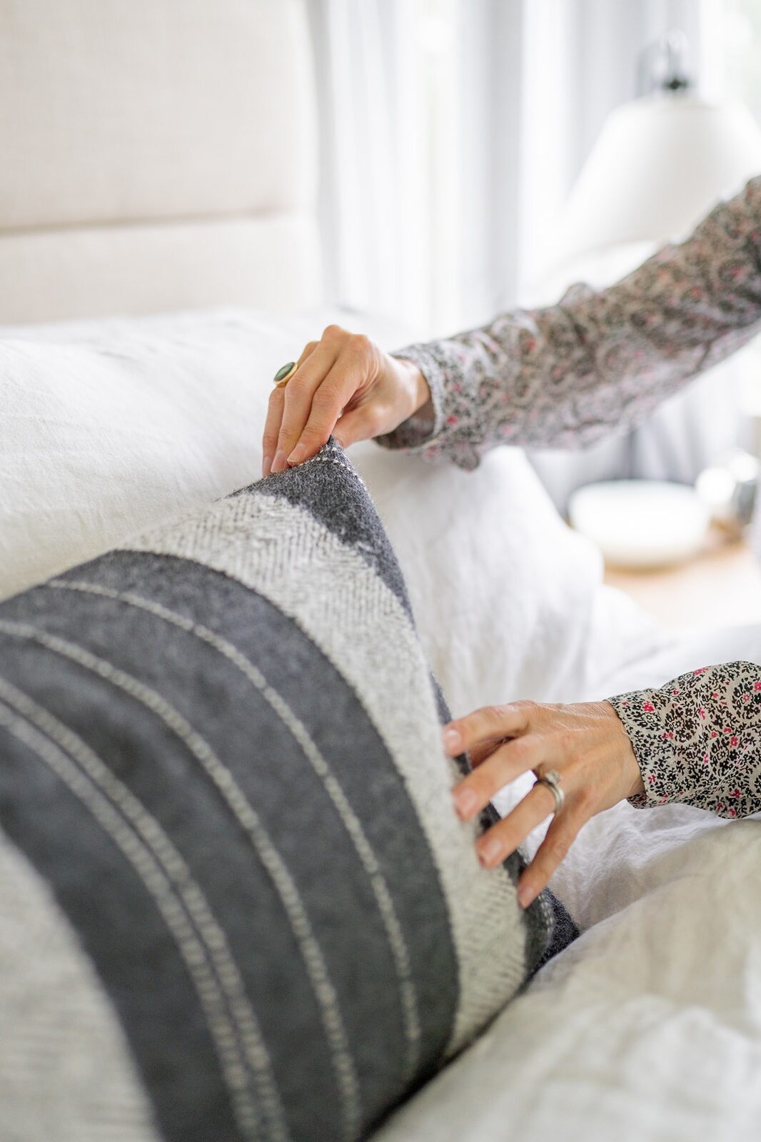
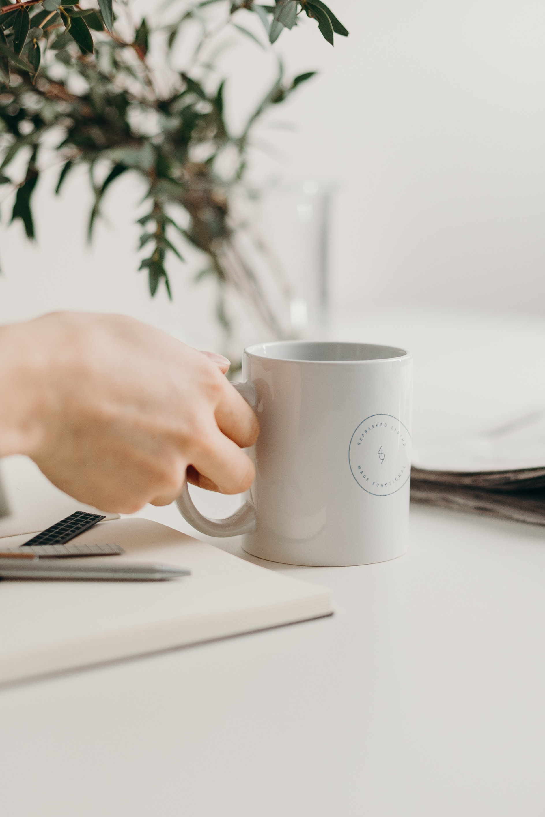
Forty Nine Interiors believes the beauty of interior design is function – it serves a purpose. It is healing, a source of joy, and an immersive experience of inspiration. Our solution was to create an identity that felt welcoming, clean, and fresh – injecting their approach of creating functional design that inspires and renews.