House of Quail
featured
The Client
House of Quail is a California-based, female-led woodworking studio with a heart for handcrafting culinary articles designed to inspire joyful moments over good food and good company.
With an architectural foundation, artistic eye, and love for fine cuisine – House of Quail blends art with function to skillfully create quality kitchen pieces built for fellowship.
The Brief
Create an immersive brand and consumer experience that embodies their bright spirit, artful products, and quality in both craft and function.
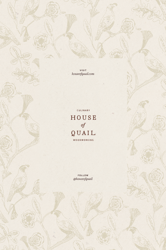
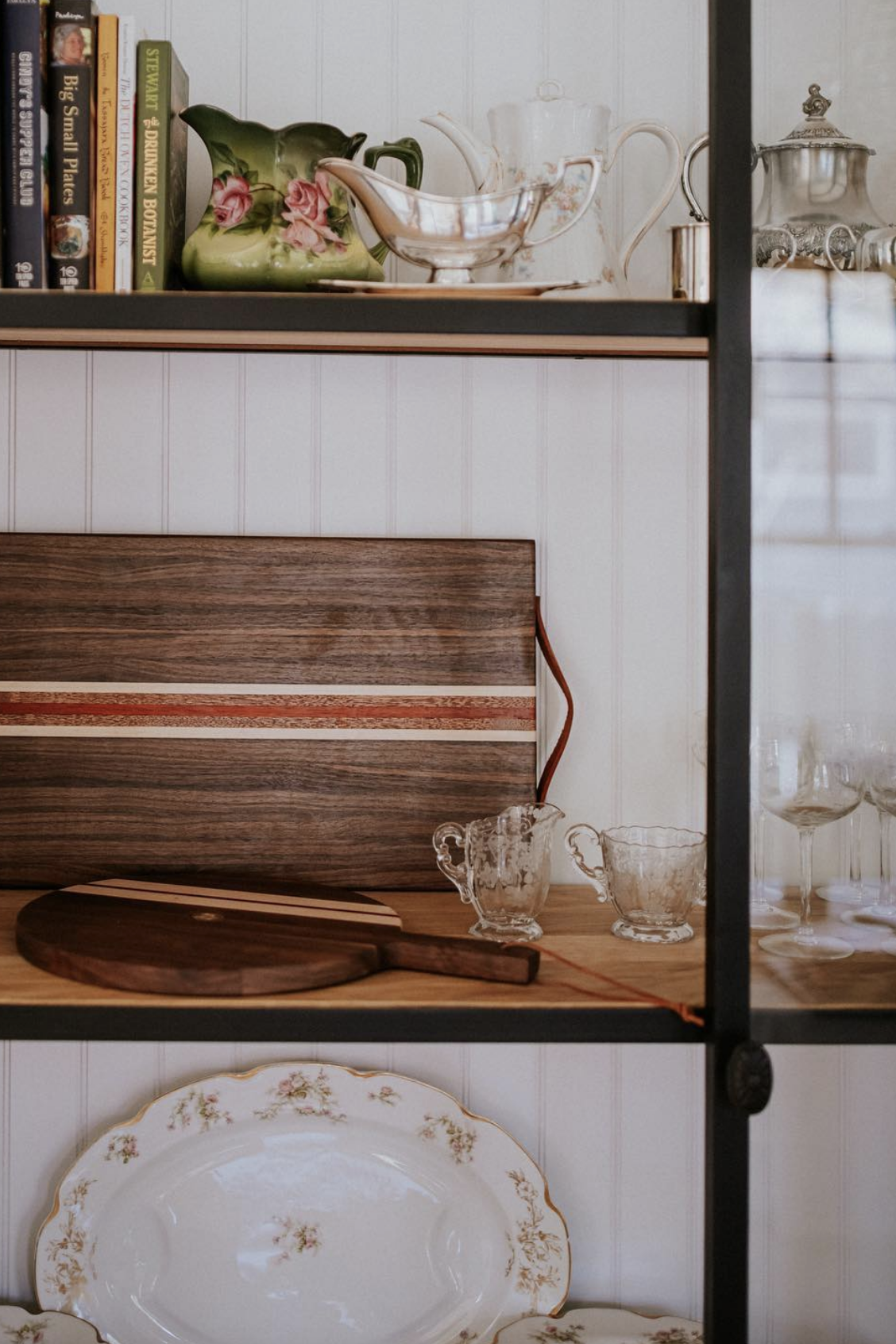
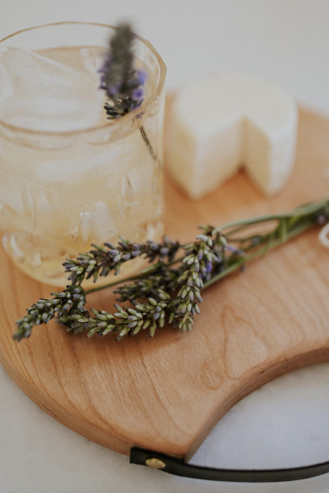
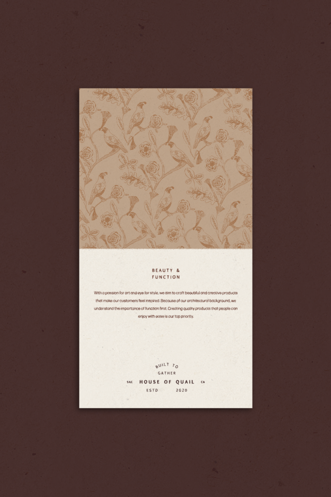
The woodworking studio formerly known as ‘Cali Girl Woodworking’ needed an identity that embodied their expert craftsmanship, attracted luxury vendors, and spoke to their polished customers – which led to pivoting to a brand name that felt more established and elevated.
When choosing a name, we wanted something that still paid homage to founder, Christina’s, Californian roots as well as honored their mission to create pieces for the modern home kitchen that celebrated connection.
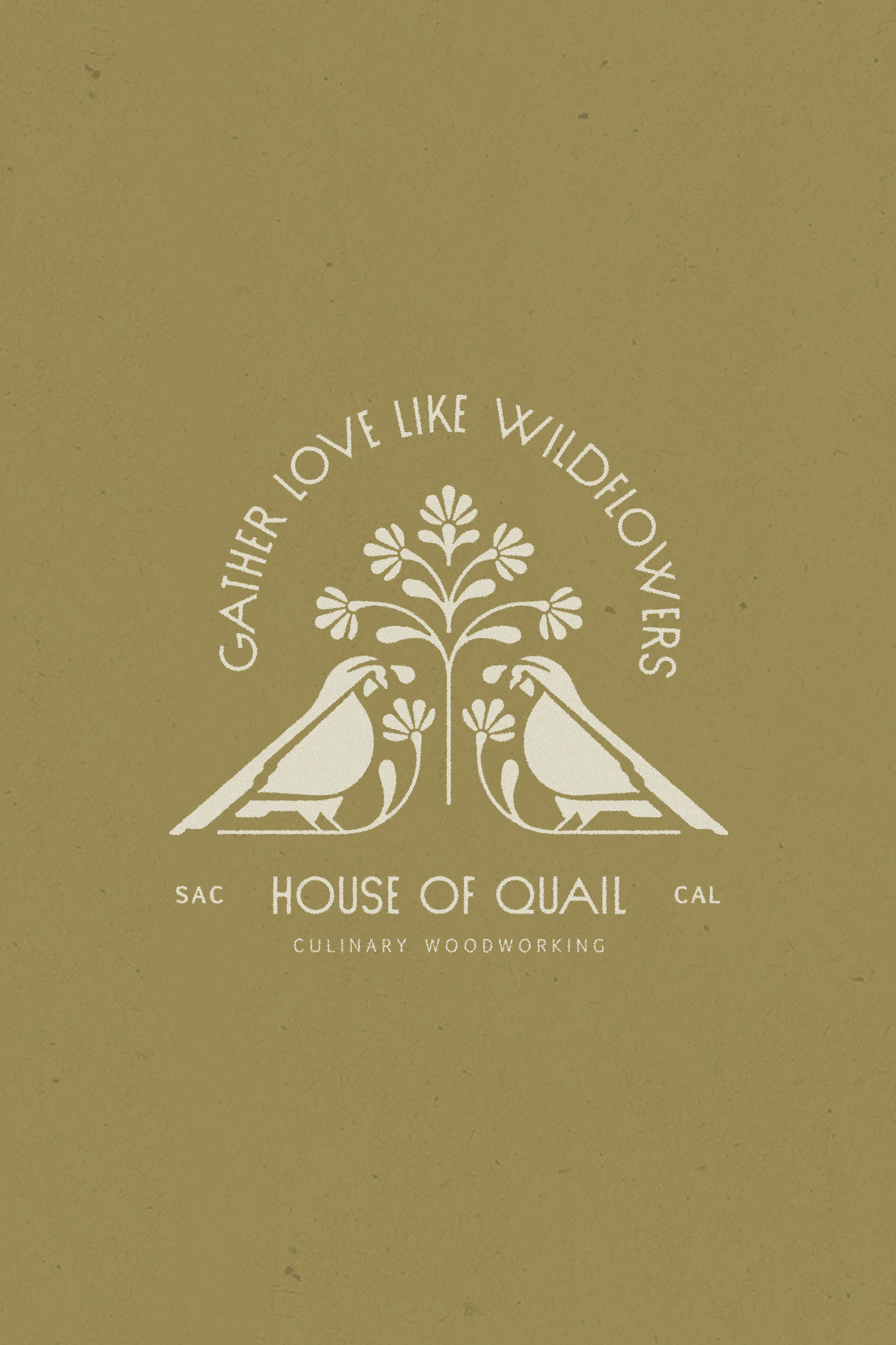
The quail, California’s state bird, is known to always be in groups – signifying the value of family, harmony, and togetherness. Highlighting this beloved figure created a natural embodiment of the studio’s mission to build pieces that bring people together.
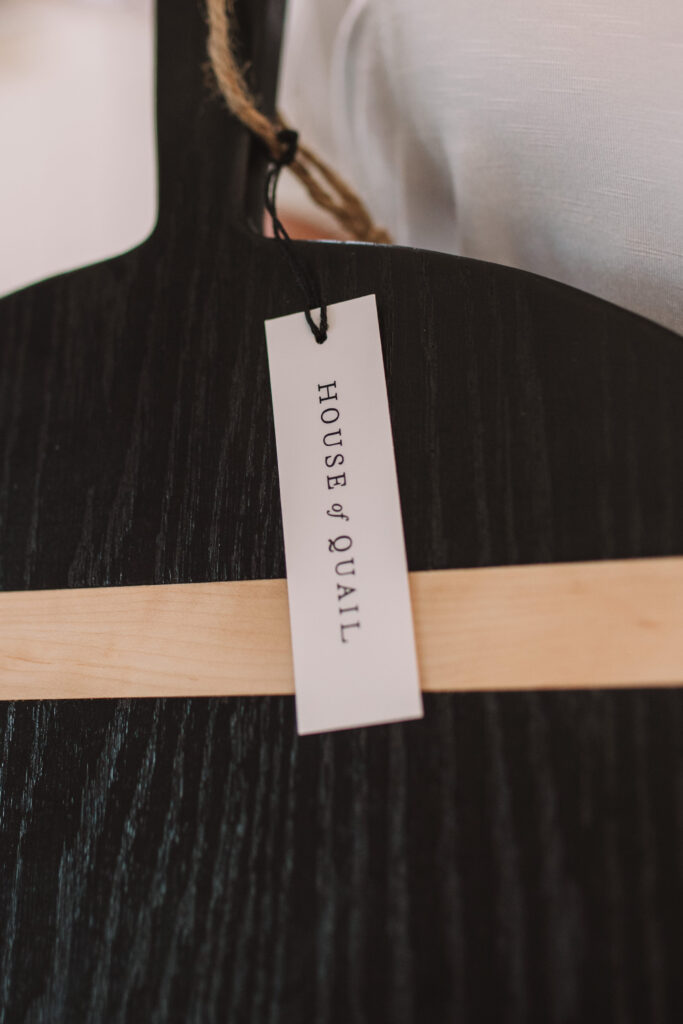
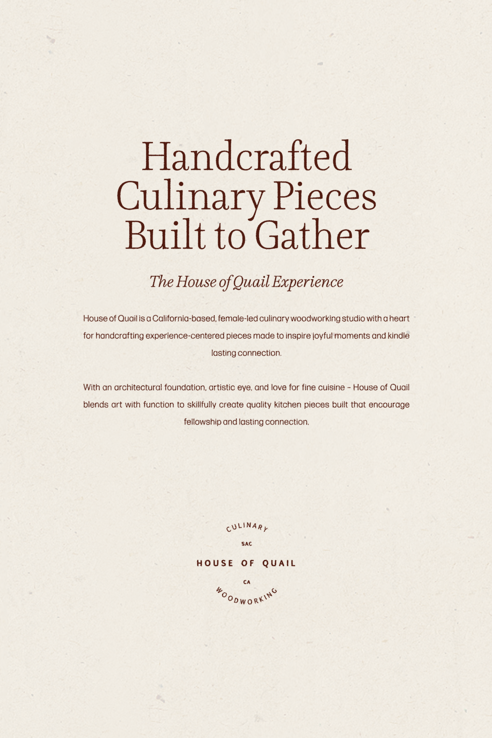
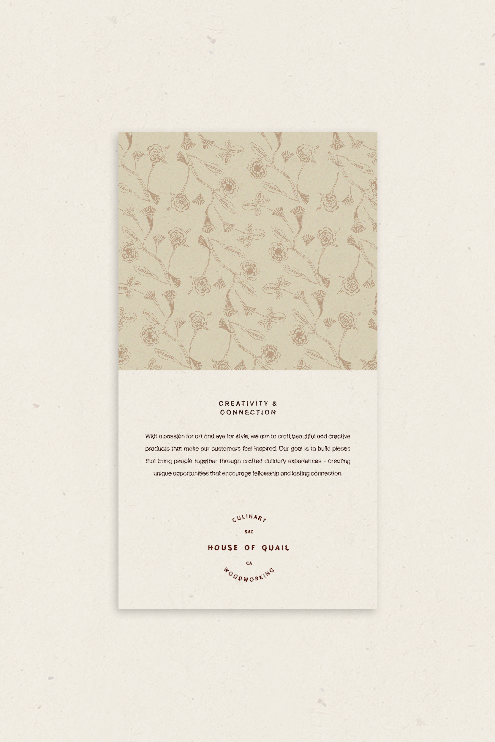
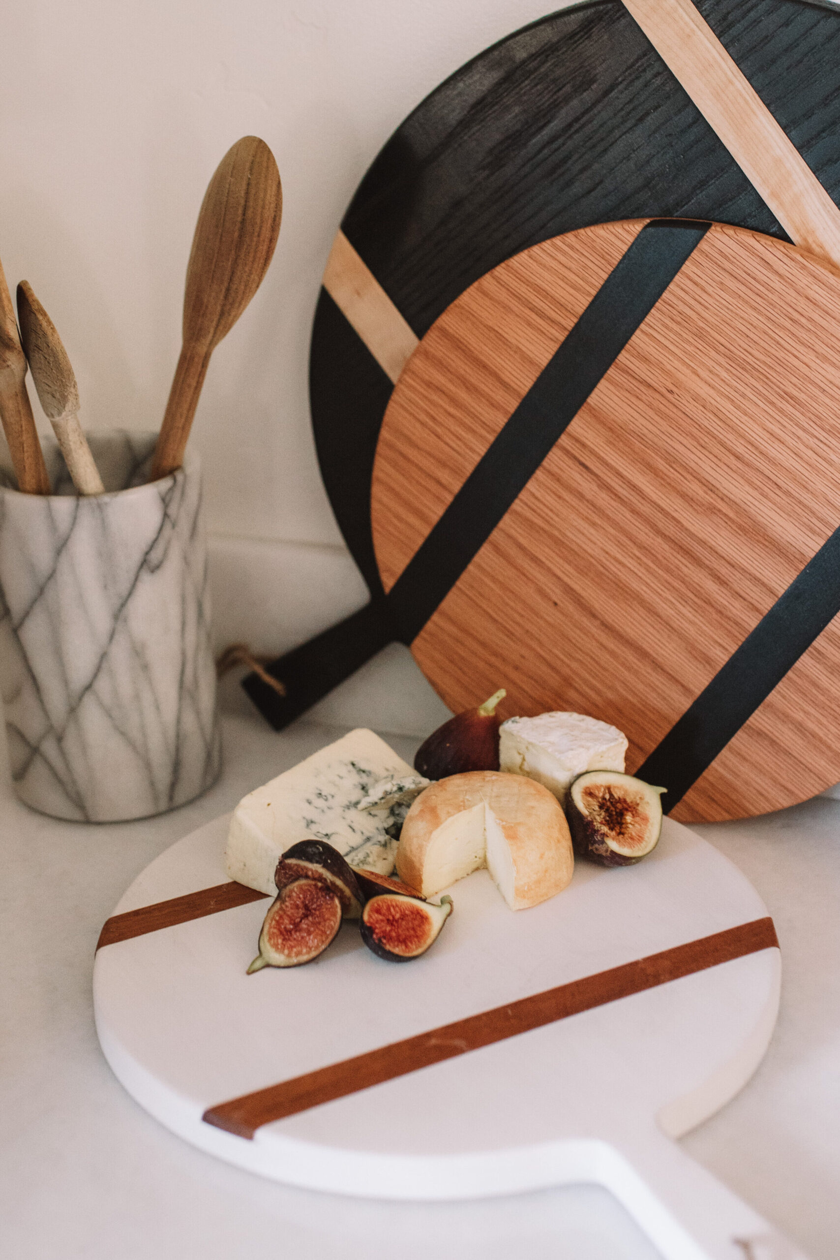
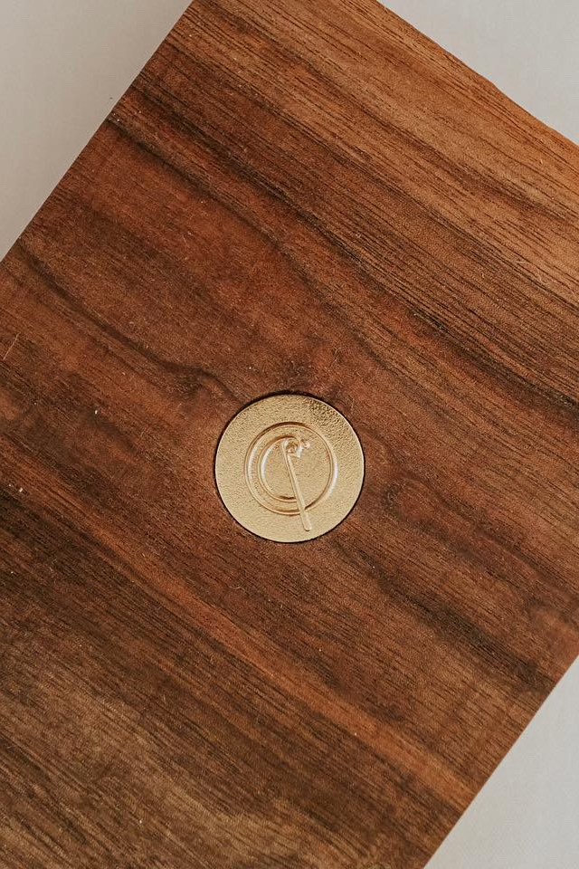
When creating the primary brand marks, it was important they be transferable to all the products while remaining distinctive – which meant they needed a solution simple enough to be engrained and debossed on materials like wood, leather, and brass.
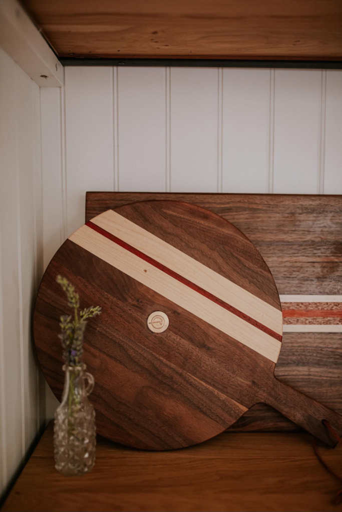
Inspired by the unique shape of their first and best-selling product, the round serving board, we created a simple yet iconic “Q” that combines a visual representation of their product and a quail.
Headquartered in Sacramento – a short hour outside Napa Valley – House of Quail often partners with wineries and boutique hotels to feature their products. We were inspired by the picturesque appeal of the Californian countryside and wanted to marry its quaint charm with Christina’s lively spirit – creating an uplifting sense of quiet luxury.
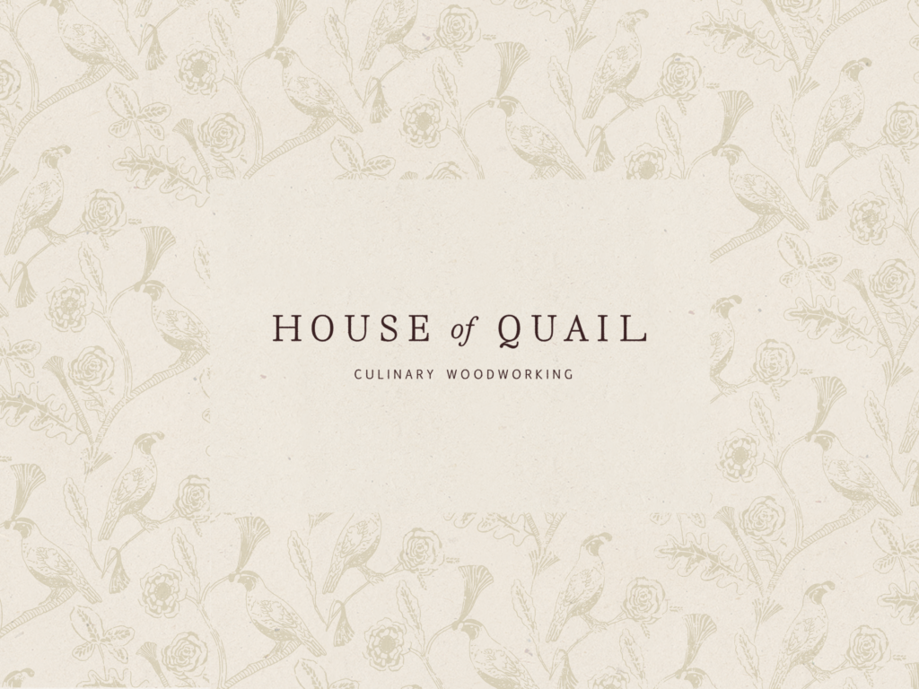
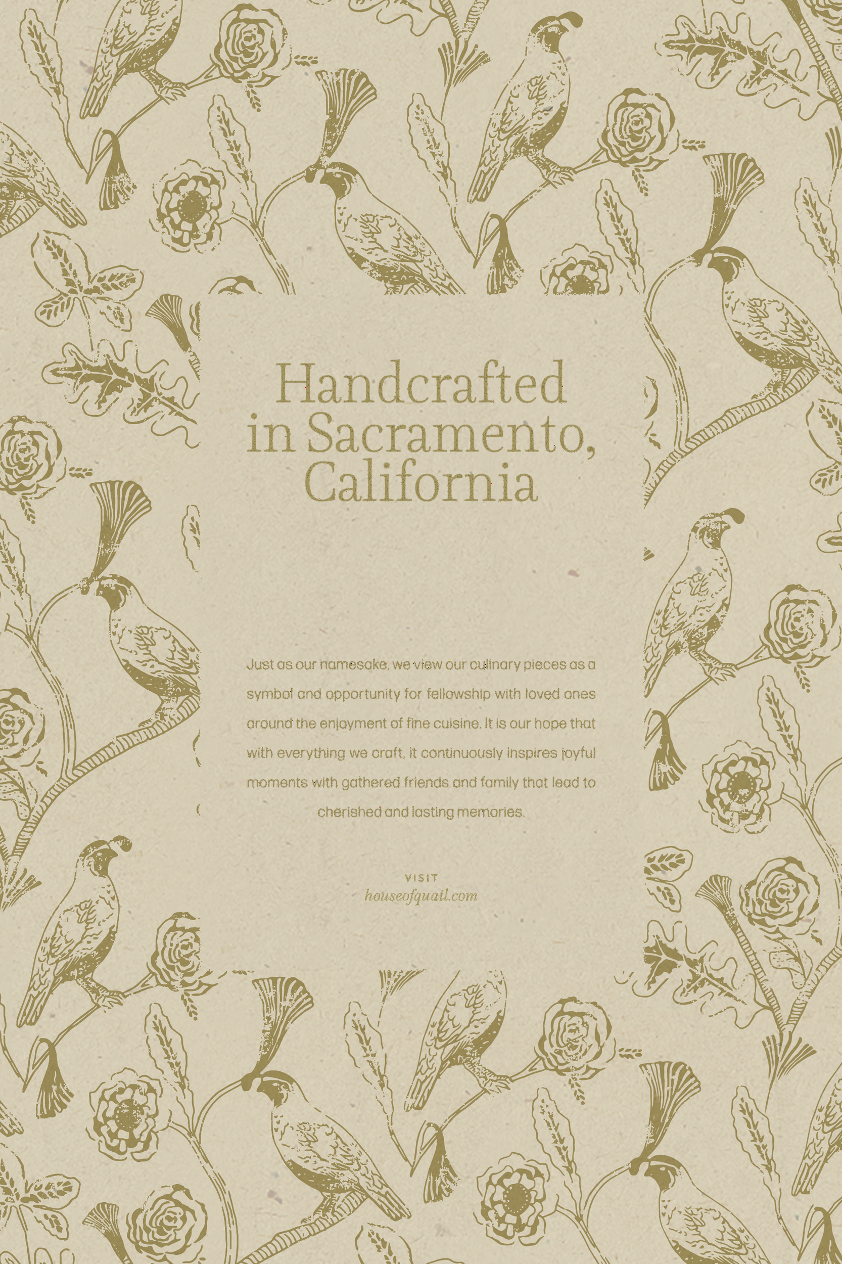
We paired a hand-illustrated, toile-inspired pattern of quails and flora with a bright color story complete with lush greens, warm oranges, and deep wines. The contrast of traditional pattern work and joyful color infuses a welcoming, artisanal feel throughout the brand experience.
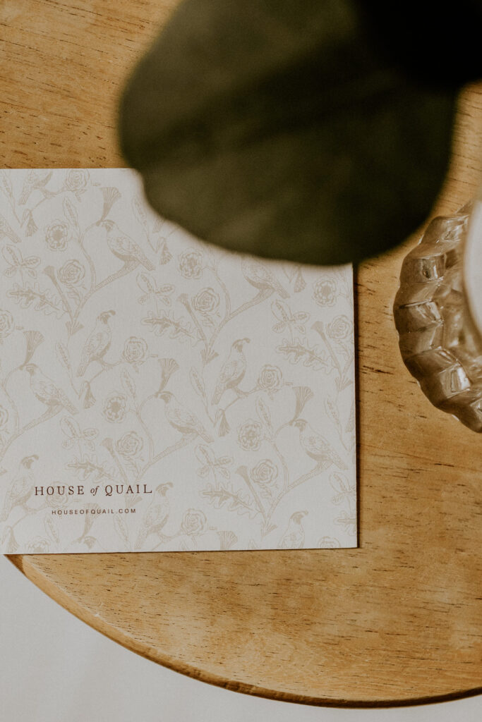
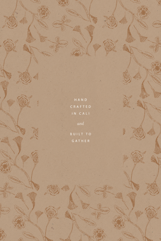
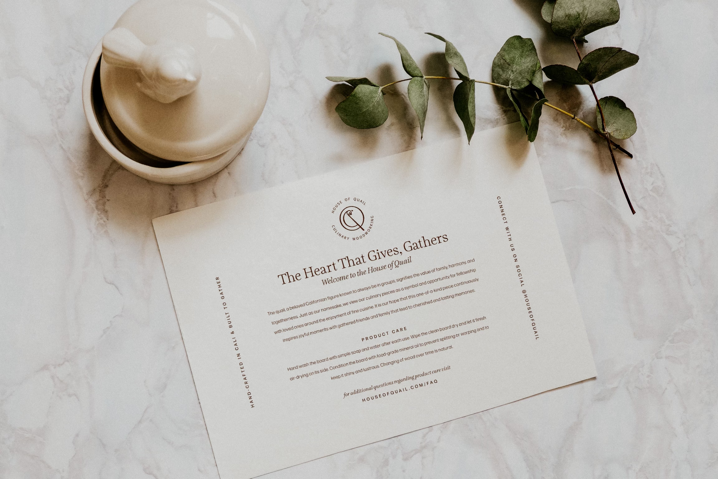
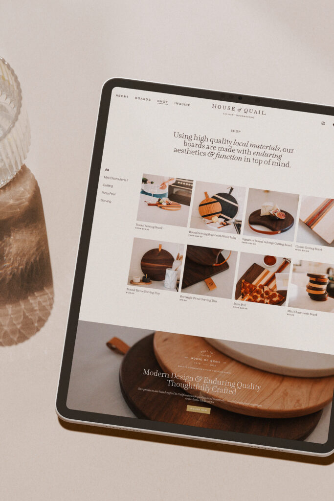
When it comes to sales, House of Quail partners with local brick-and-mortar vendors and pop-up markets in addition to their online storefront – which meant it was important to craft an elevated e-commerce experience with printed marketing materials that matched.
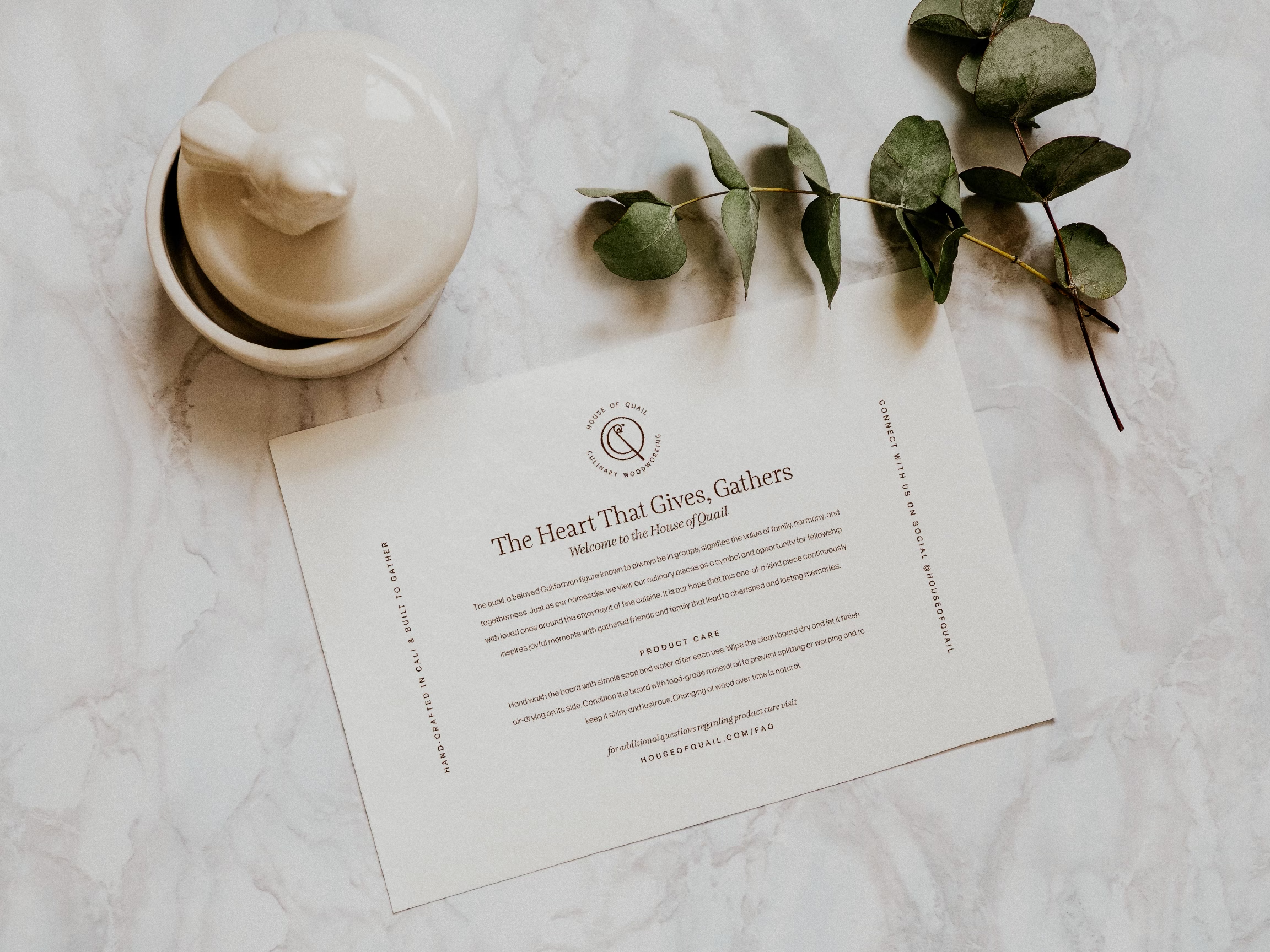
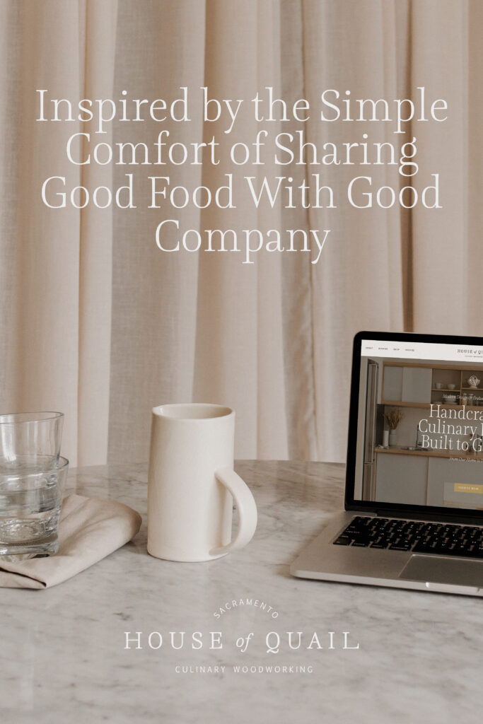
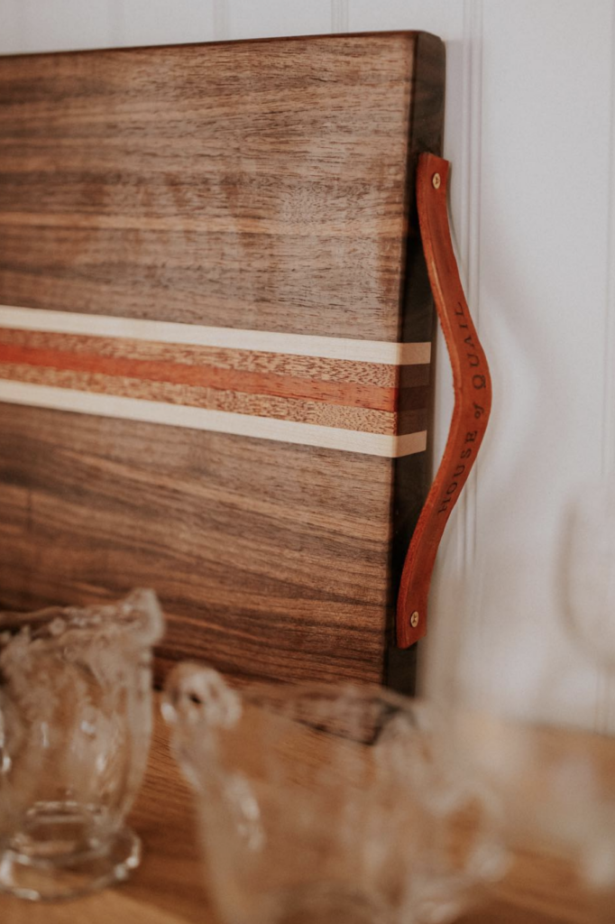
An airy, intuitive website featuring thoughtfully-styled product imagery and elevated packaging complete with price tags, welcome cards, and sustainable carry-out bags ensured the customer underwent a refined experience regardless of the transactional avenue.
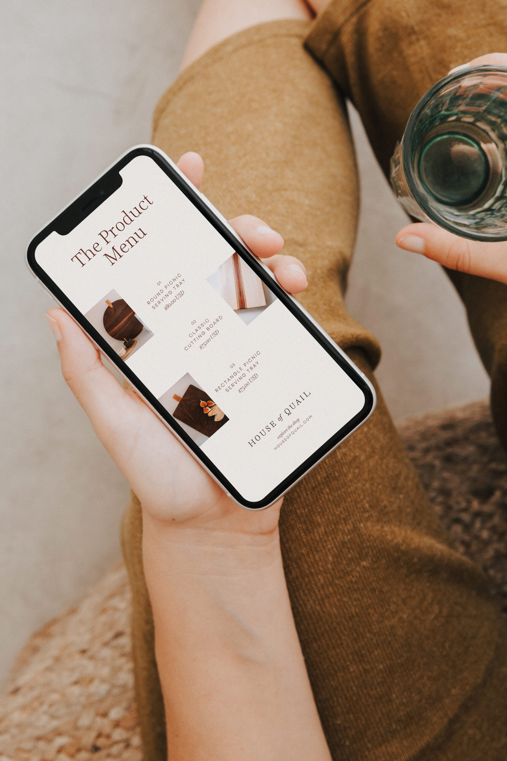
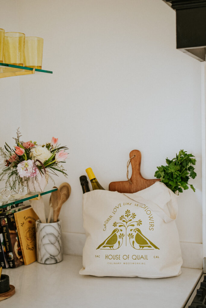
From brand storytelling and visuals, photography direction, website design, product packaging, and merch, we were able to weave a cohesive, heartwarming feel throughout each touchpoint – resulting in a distinguished and thoughtful customer experience.