Kat Clark Interiors
featured
The Client
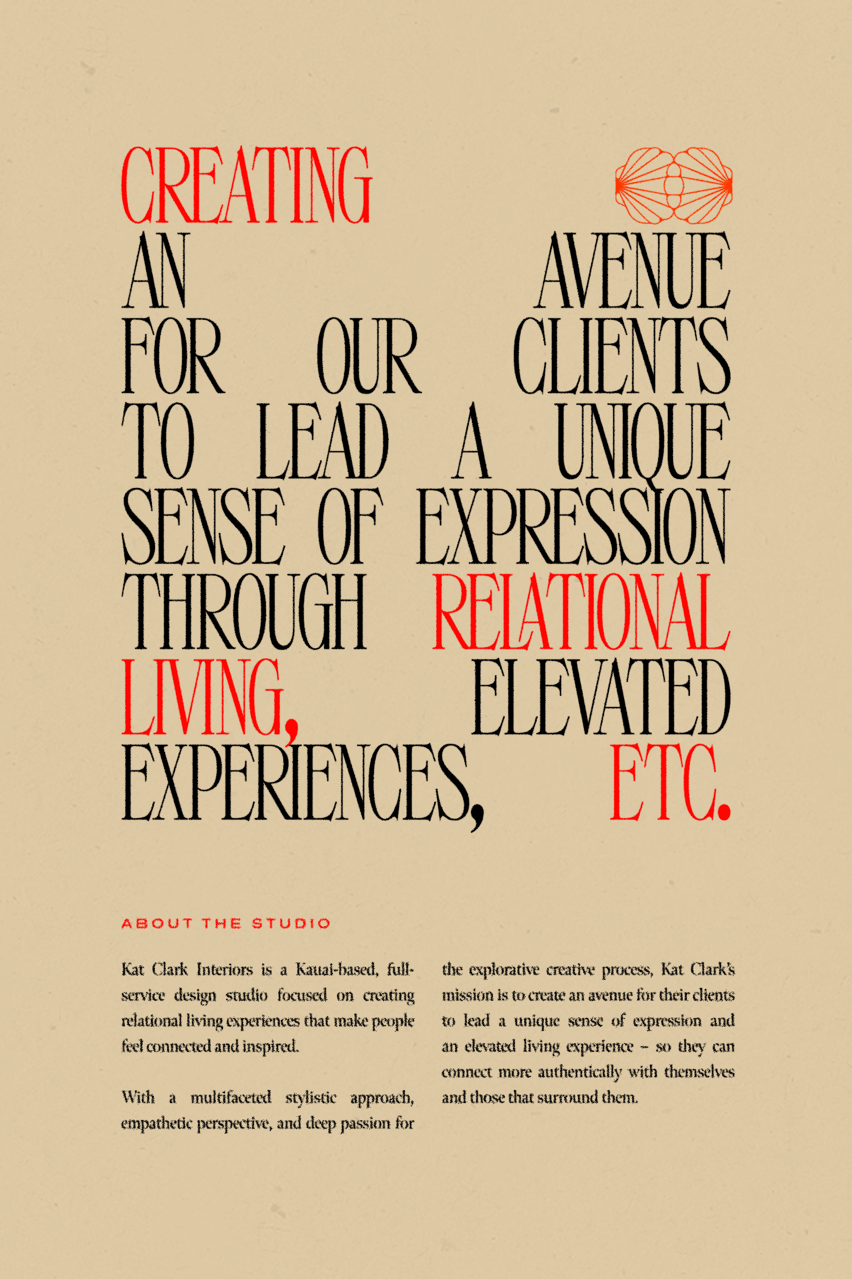
Kat Clark Interiors is a Kauai-based, full-service design studio focused on creating relational living experiences that makes people feel connected and inspired.
With a multifaceted stylistic approach, empathetic perspective, and deep passion for the explorative creative process, Kat Clark’s mission is to create an avenue for their clients to lead a unique sense of expression and an elevated living experience – so they can connect more authentically with themselves and those that surround them.
The Brief
Create a brand identity that reflects their luxury services, the connective experiences they create, and their bold passion for creative-play.
Kat Clark Interiors sees power in boundless creative expression and aims to create vulnerably, explore boldly, and constantly challenge the act of self expression.
It was important that we captured their fresh approach to design and love for unexpected solutions, which meant creating a brand identity that felt graphic, playful, and offbeat while maintaining a degree of elevation.
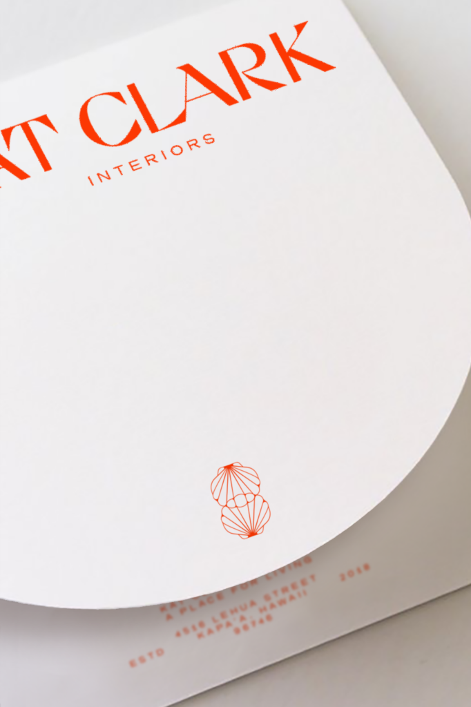
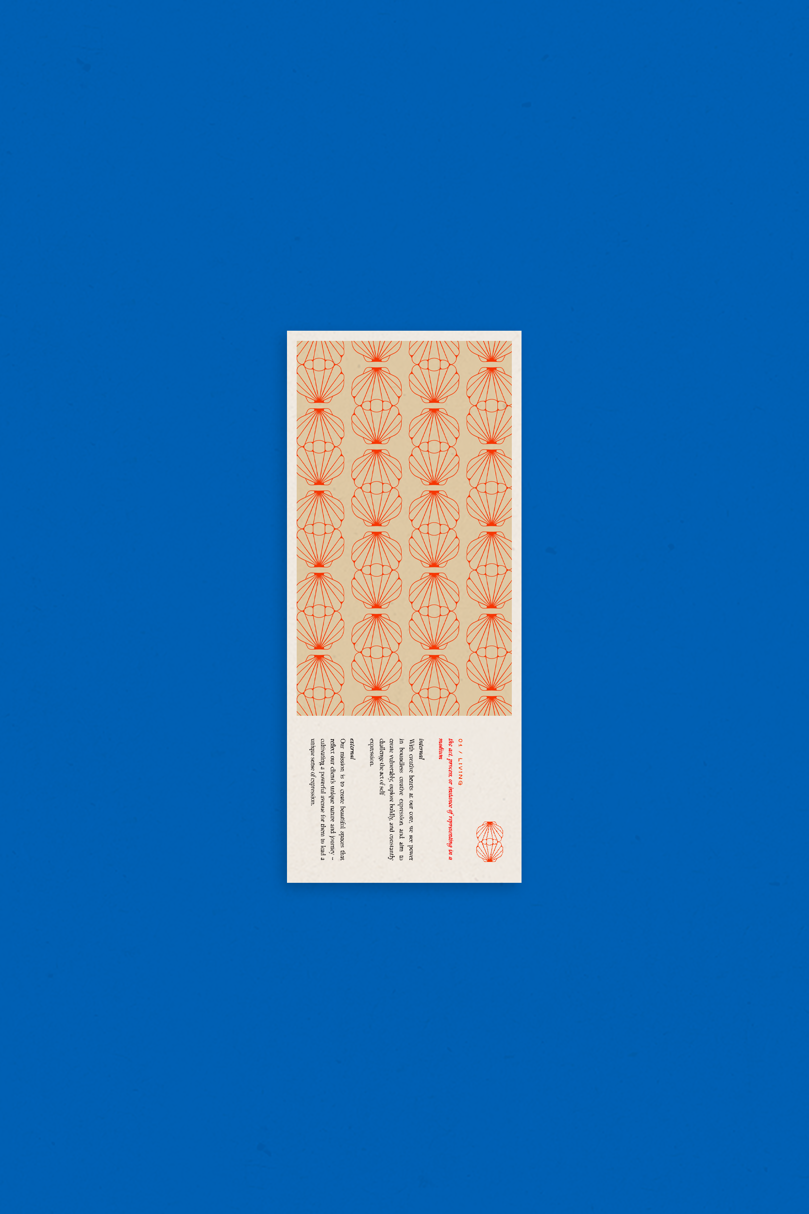
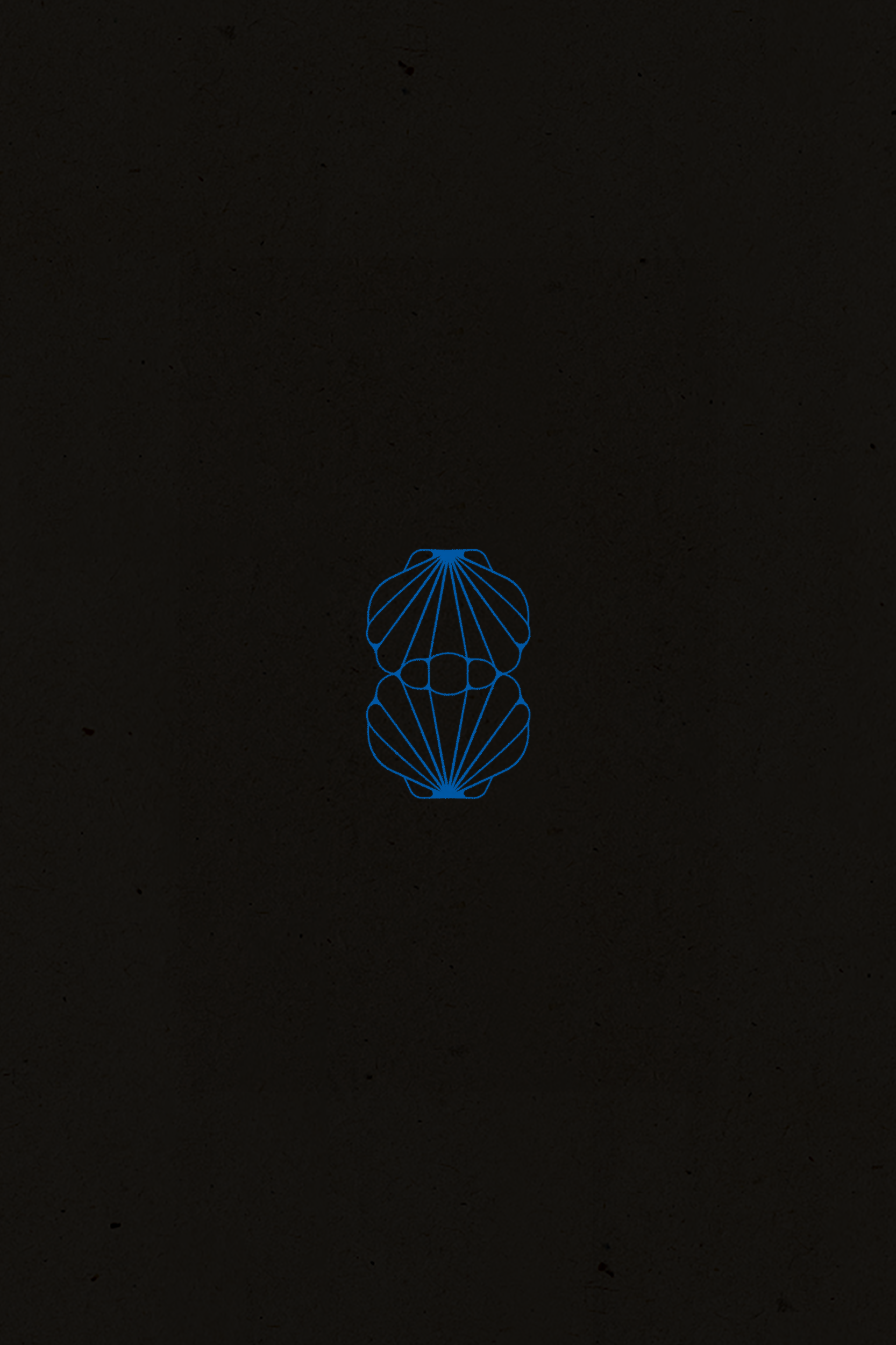
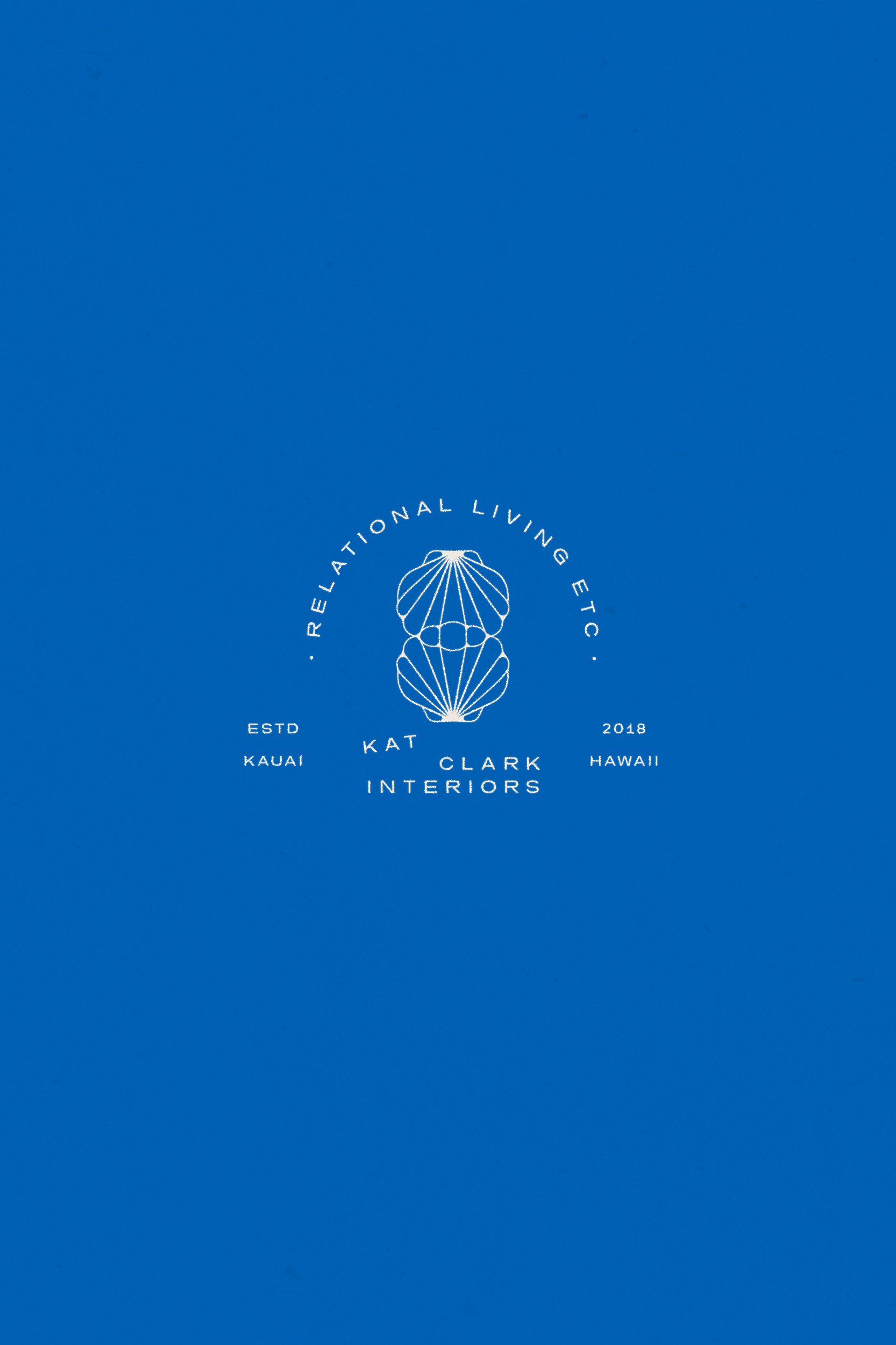
Through visual storytelling and functional artistry, Kat Clark creates opportunities that embolden their clients to connect more authentically with themselves and those that surround them. To highlight that connective value, we created a primary icon by stylistically overlapping two seashells – bringing in a relational, Hawaiian influence in a modern way.
A seashell is a protective outer layer created by a sea animal – providing a sturdy and beautiful home for the creature to survive, which embodies a beautiful parallel of creating artistic and functional spaces for Kat Clark’s clients to thrive.
Seashells are strong and defiant against the mightiness of the ocean – symbolizing a strong mindset that resists pressure. The defiance to pressure reflects Kat Clark’s natural draw to go against the grain when it comes to design, celebrating the irregular and finding balance in the unexpected.
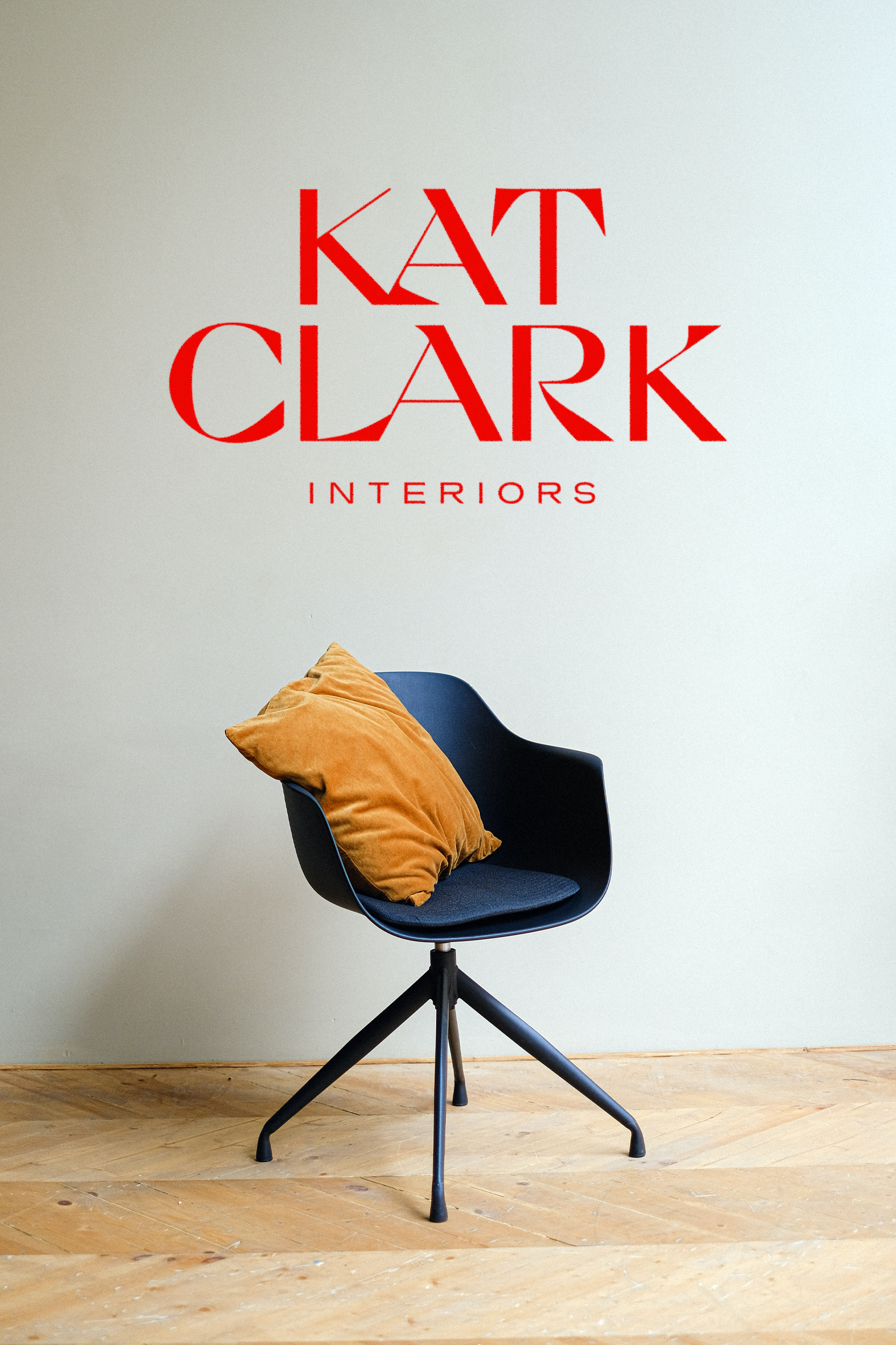
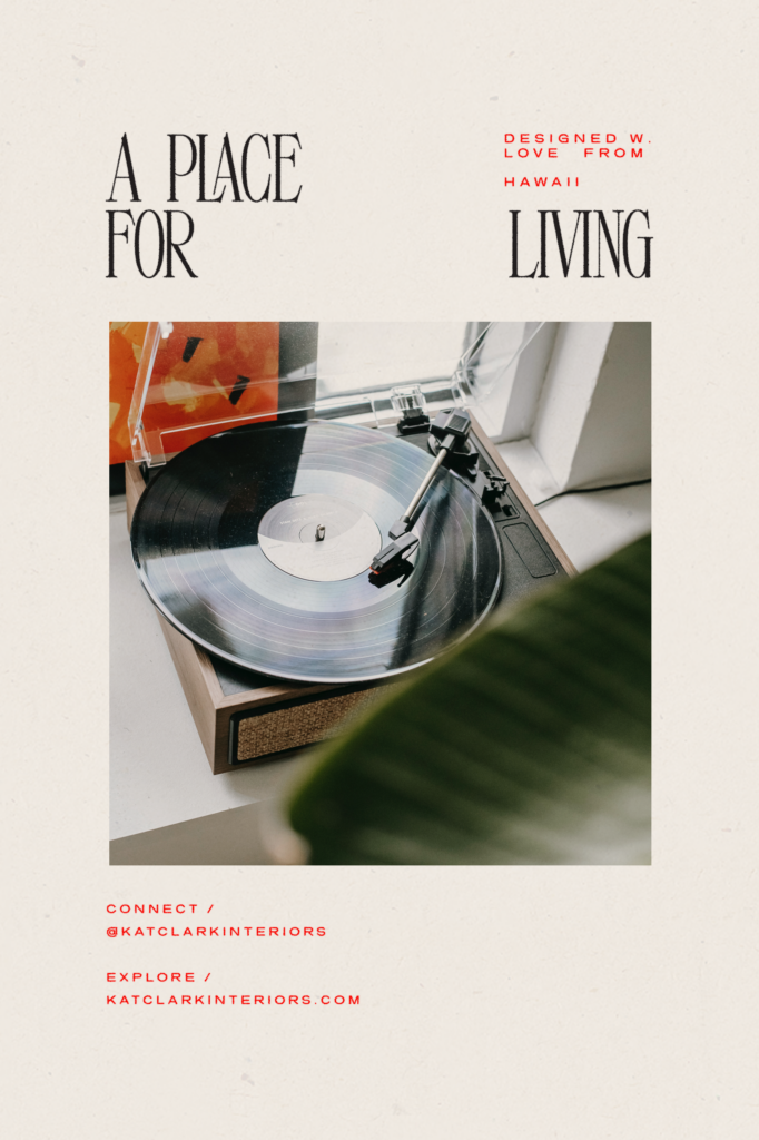
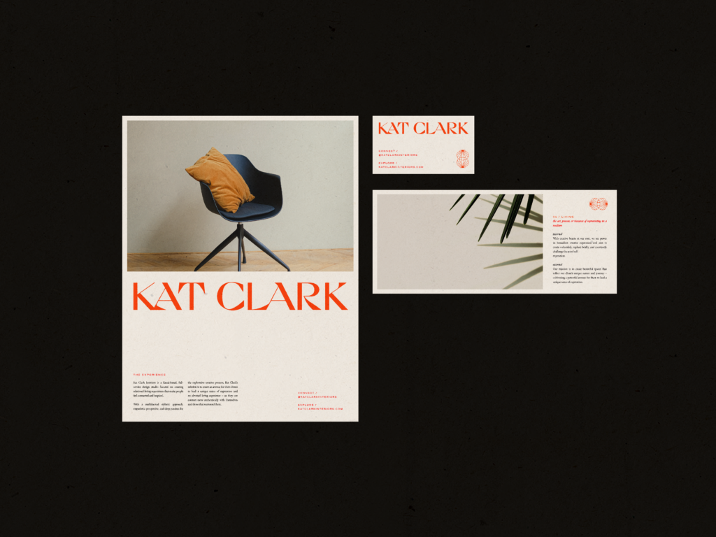
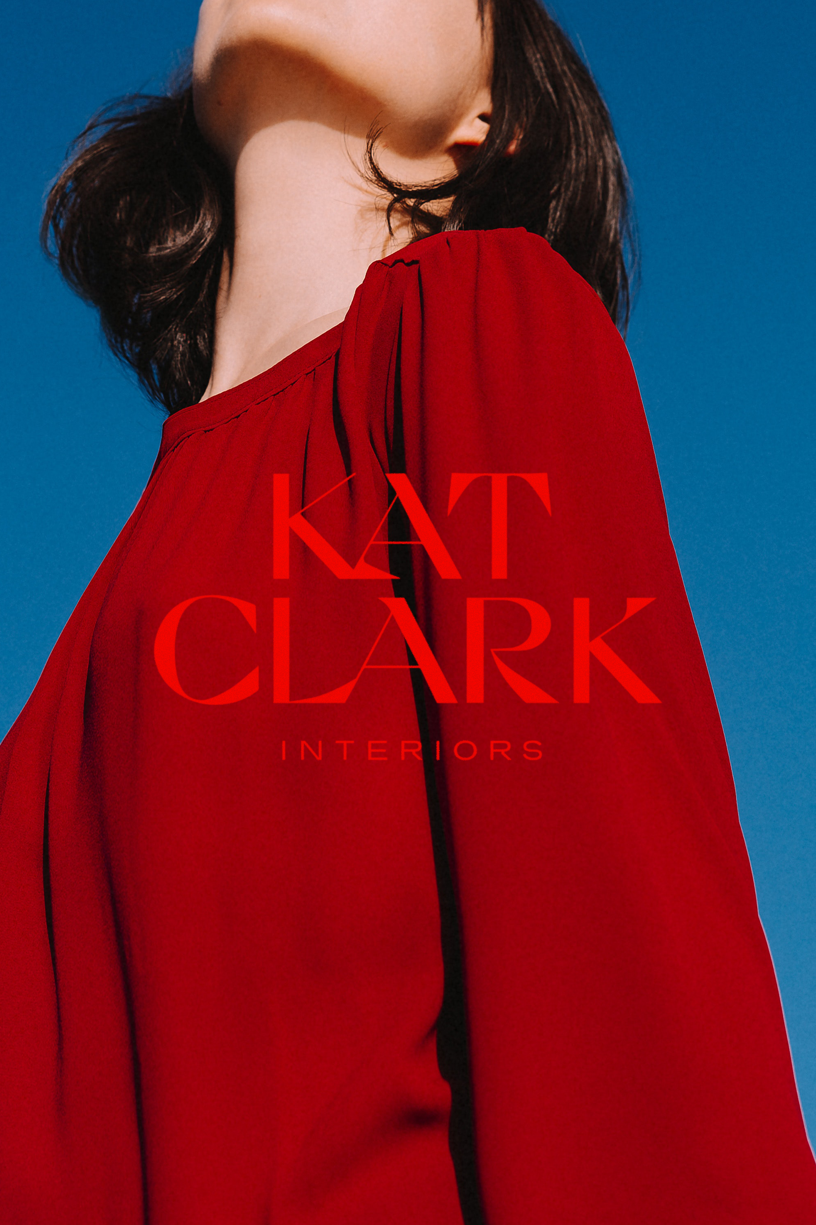
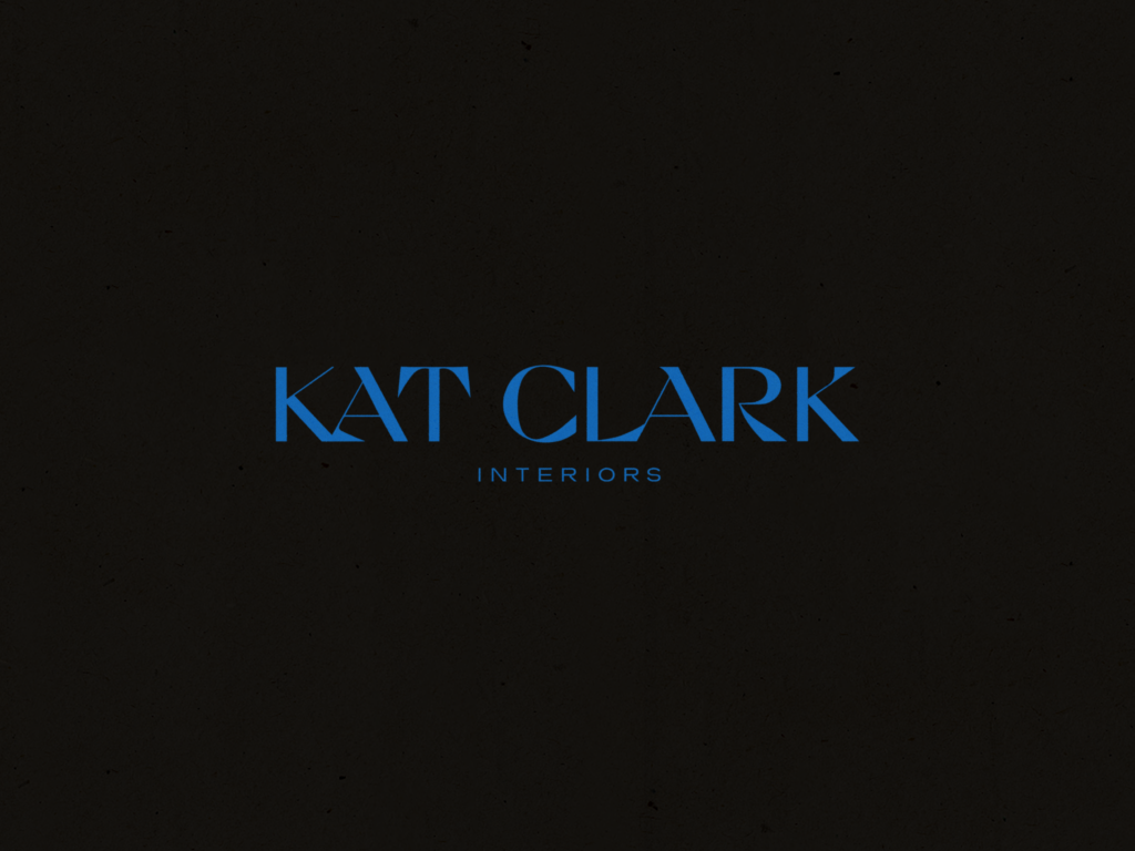
For the typography, we created an artistic yet refined wordmark where no two letters are the same – resulting in an eclectic, repetitive, offbeat feel. Overlapping lettering re-establishes their intimate sense of connection while dynamic shifts in thick/thin line-weight and fluid shape-work evoke a strong sense of balance between trust, fluidity, and creative expression.
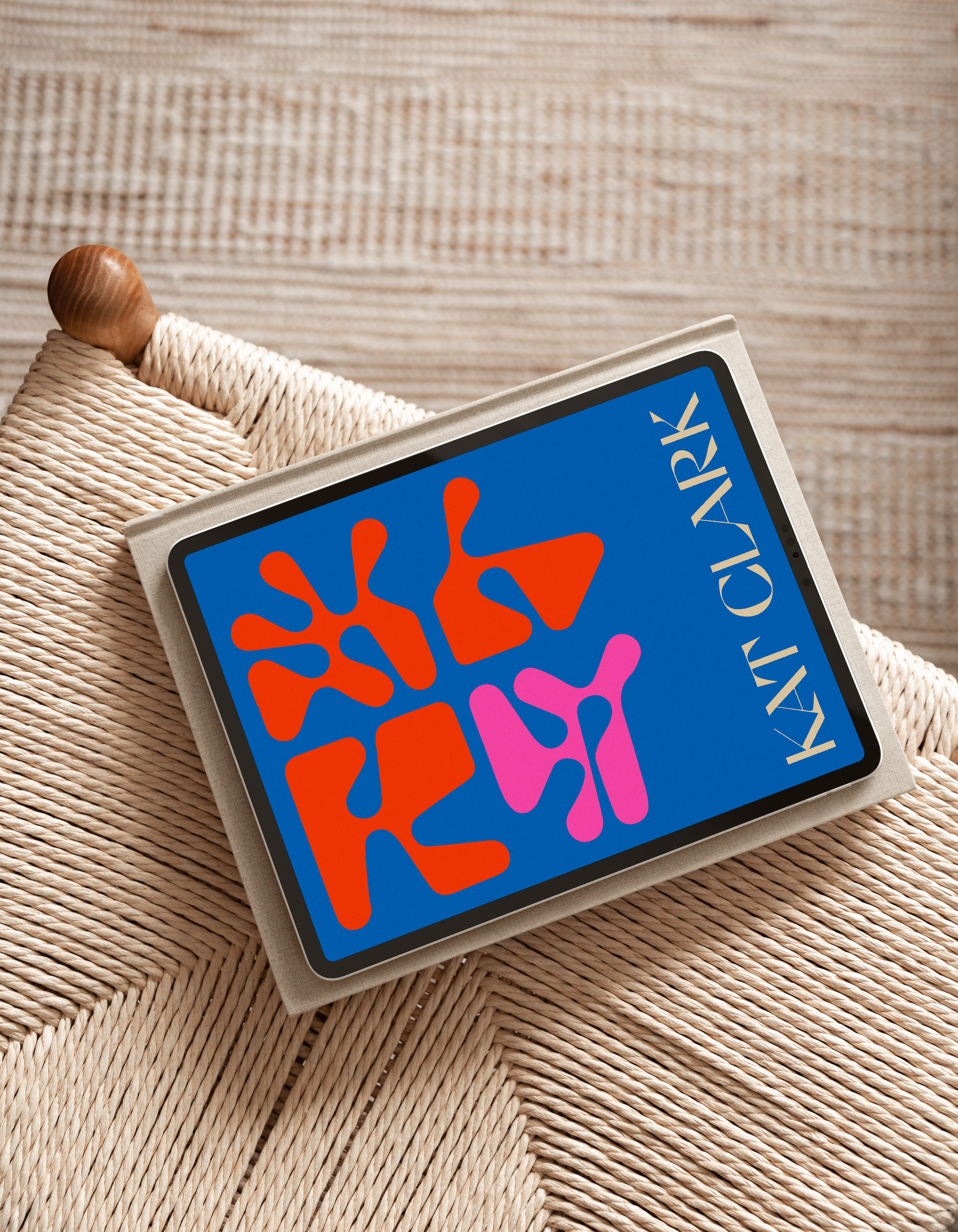
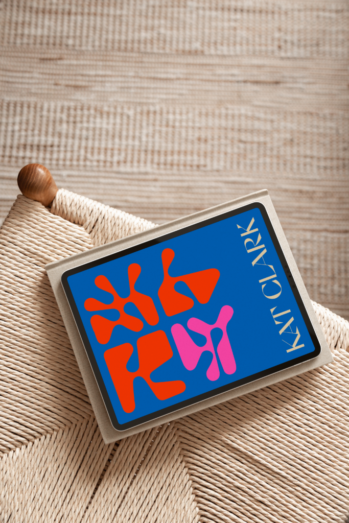
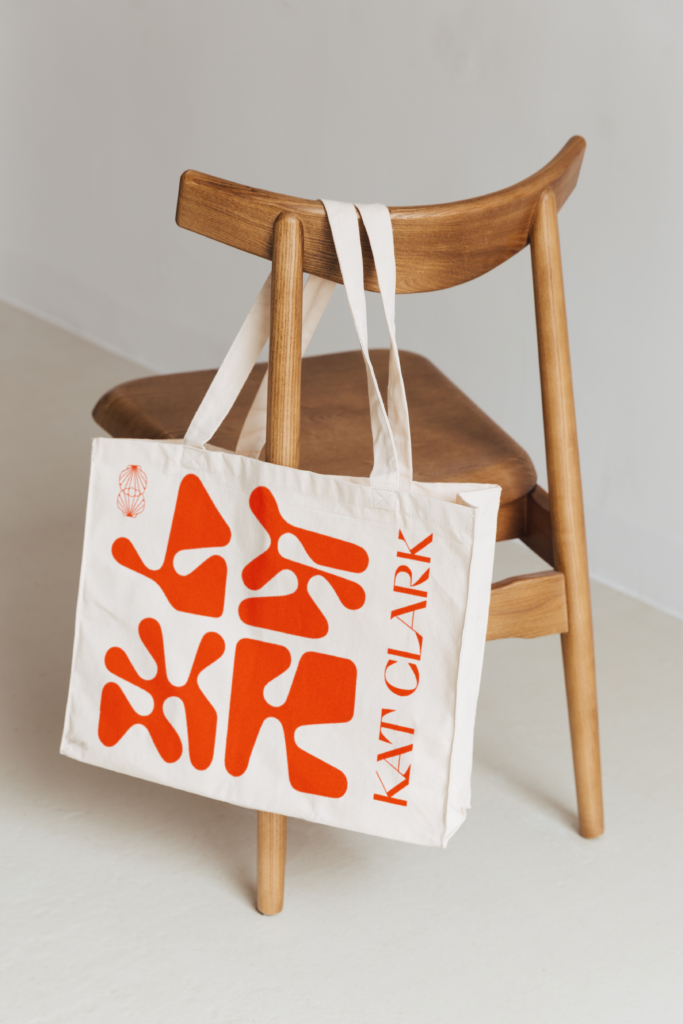
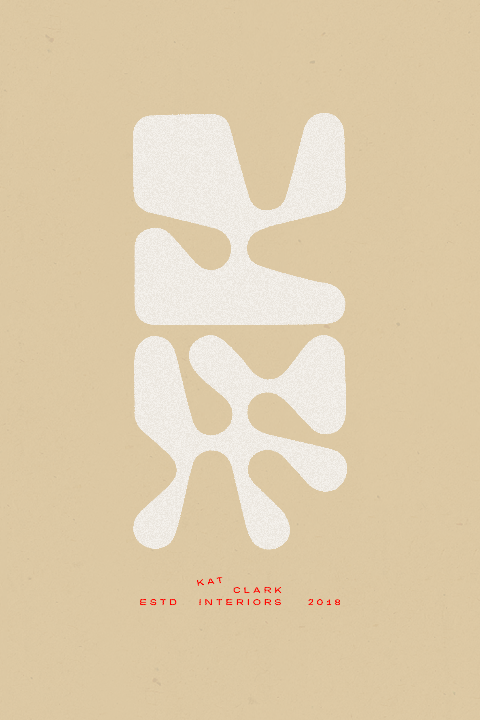
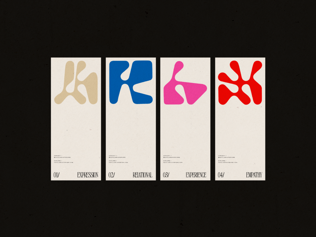
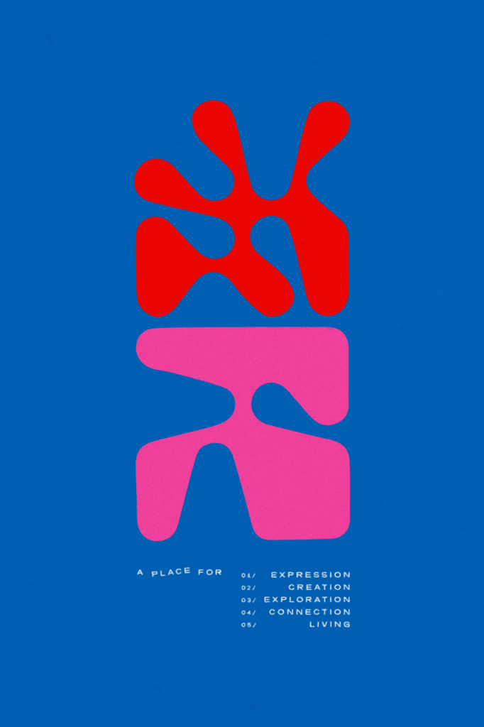
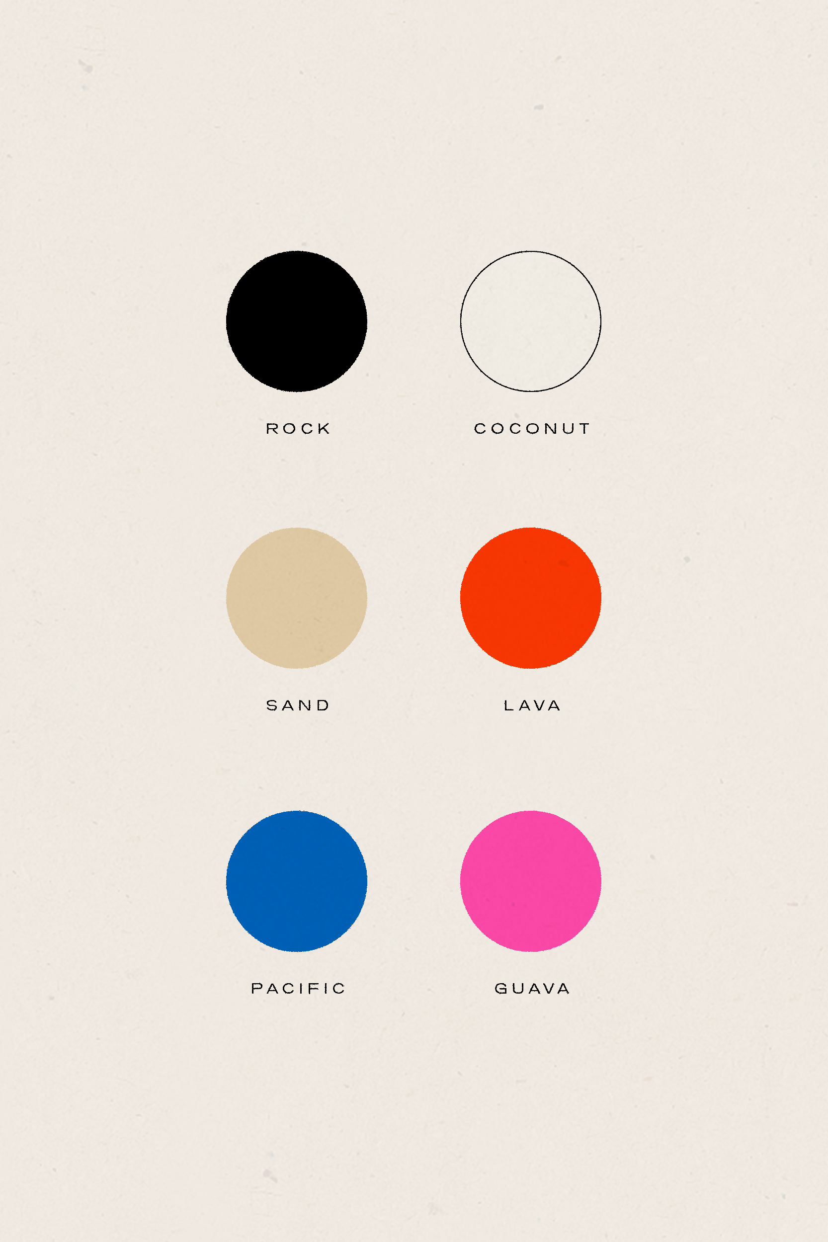
To create a distinct identity that balanced Kat Clark’s lively attitude with their rich love for the island, we crafted a vivid color story paired with modern, irregular shapes inspired by sea coral. Limitless combinations of the punchy palette and peculiar design patterns ensures the brand will stay fresh, adaptive, and cohesive.
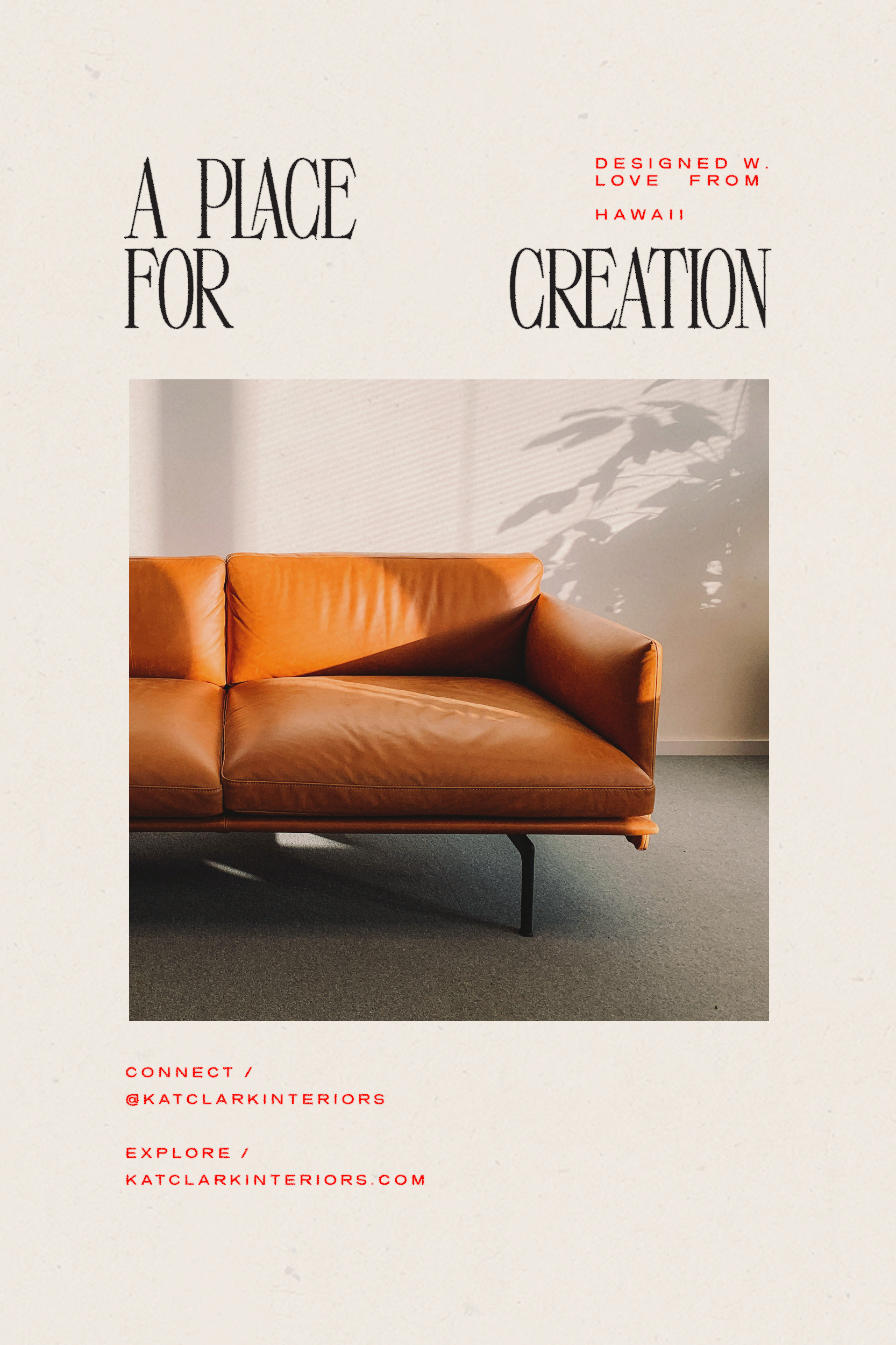
Through an exploratory process that crosses creative boundaries between medium, style, and form, Kat Clark creates emotive spaces that touch the senses and take the dweller on an immersive atmospheric journey.
Our goal was to create an identity that feels stimulating and inspired while artistically embodying Kat Clark’s values, process, and vision – effectively communicating to their audience their strong sense of quality, creativity, connection, and experience.