Benevo Events
featured
The Client
Headquartered in Texas and serving clients globally, Benevo Events is a full-service, luxury event planning studio focused on crafting immersive, relational-centered, experiences planned to unite. Pushing the traditional event industry boundaries, Benevo is re-imagining what it means to bring people together – partnering with those seeking a personalized approach, genuine connection, and unmatched artistic solutions to craft unforgettably joyful experiences.
The Brief
Create a brand identity that reflects their supportive approach, genuine spirit, sleek style, and elevated solutions.
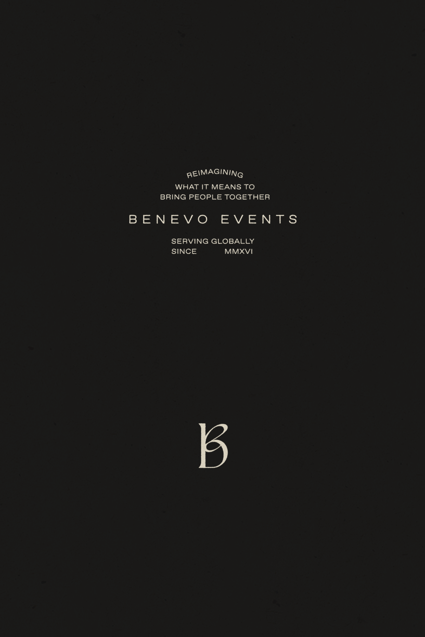
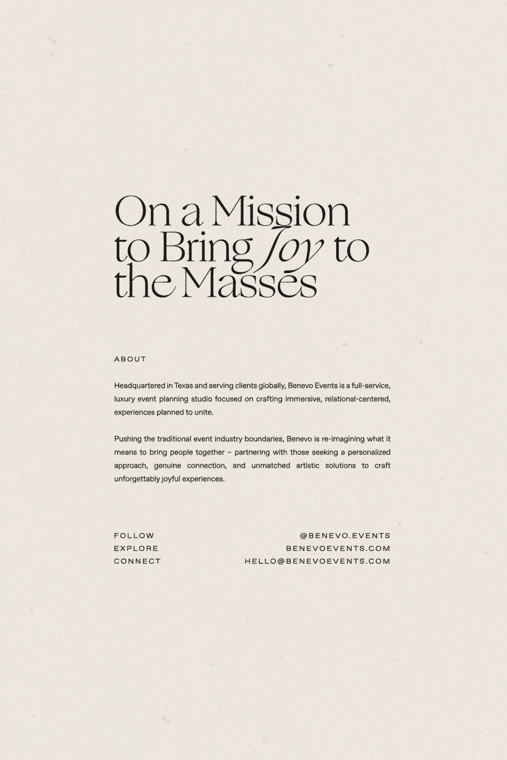
Formerly Abbie Cole Hillis Events (ACH Events) and self-named after founder Abbie, the studio was entering a new stage in business: expanding partnerships and refining services to reflect not only weddings, but luxury corporate event planning as well. As they were planning to elevate and refine the brands reach, co-owners Abbie and Mikayla needed help creating clear alignment with the brand visuals and story, beginning with their name.
We landed on Benevo Events which was created from an artistic shortening of the word ‘benevolent’ – meaning the desire to do good, help others, and express goodwill. Benevo beautifully embodies their core mission to bring joy to the masses through uplifting experiences planned to unite.
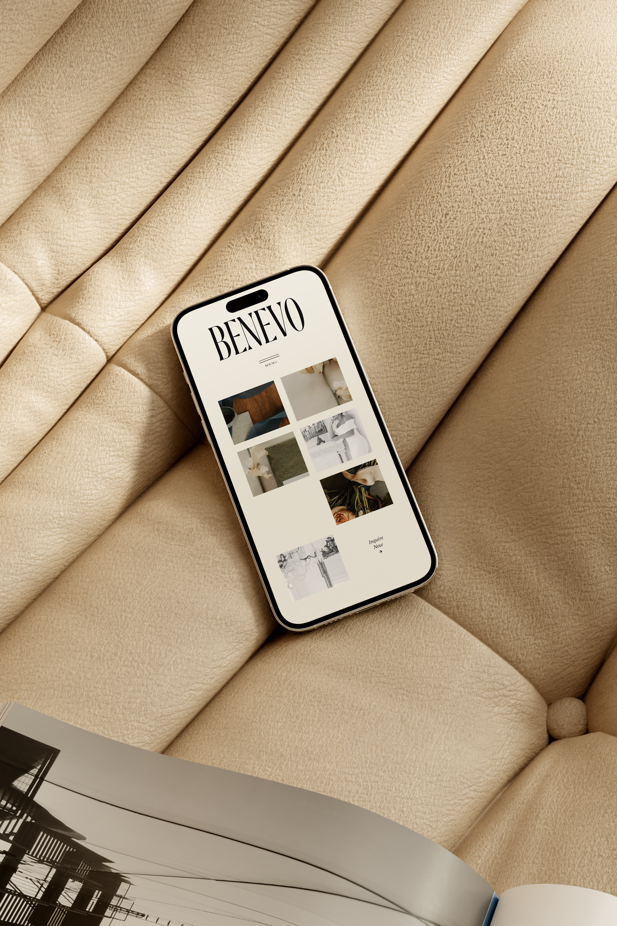
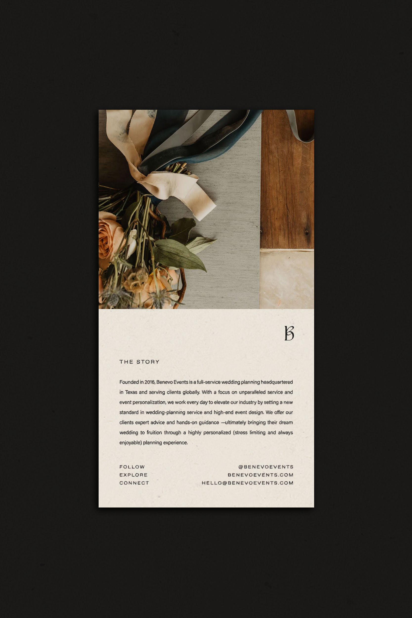
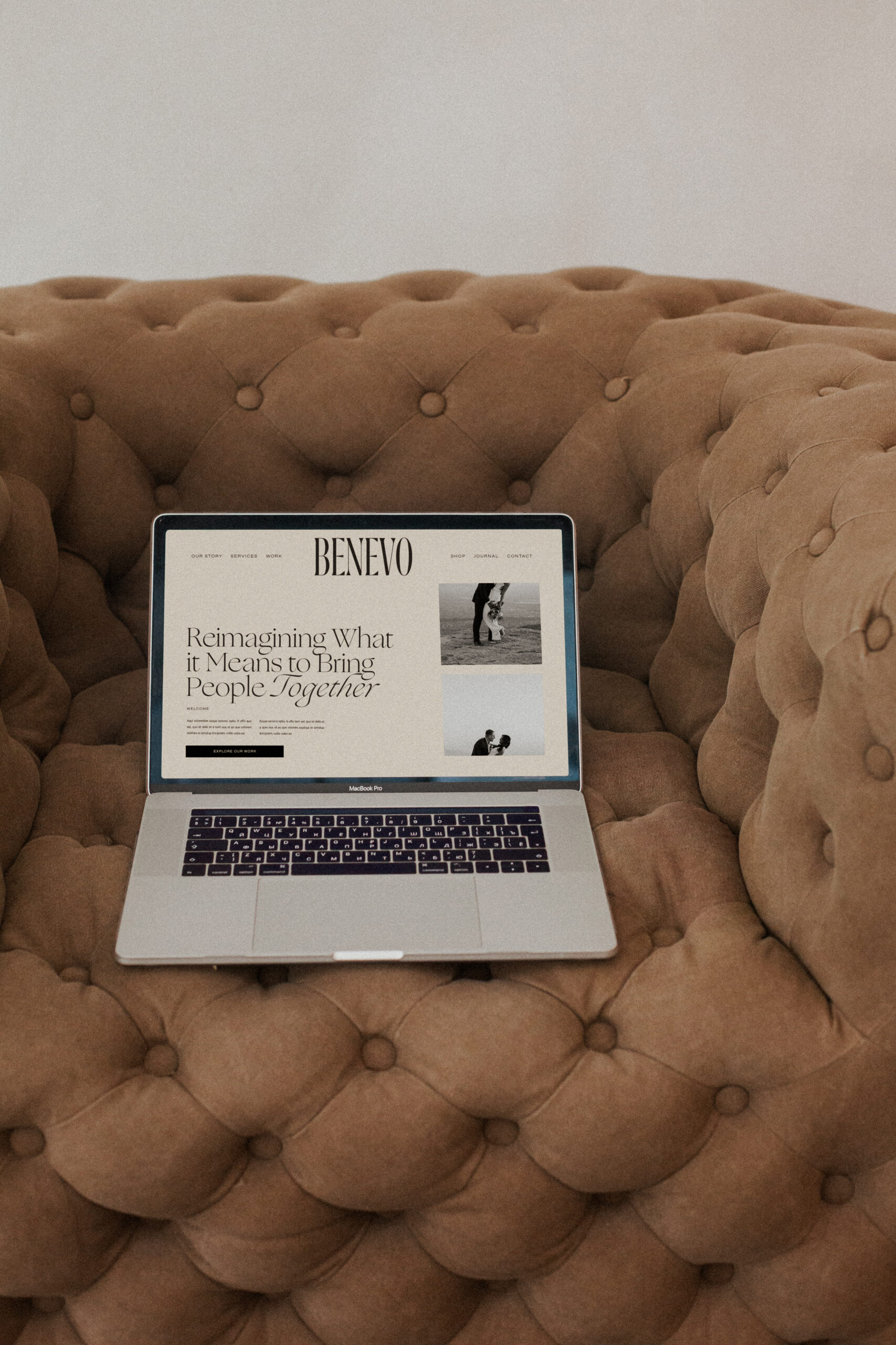
With their goal to attract higher-budget clients in metropolitan areas worldwide, we shifted their brand positioning from feminine-wedding focused visuals to a modern, open, editorial-forward narrative – creating a brand that feels bold, sophisticated, and fresh.
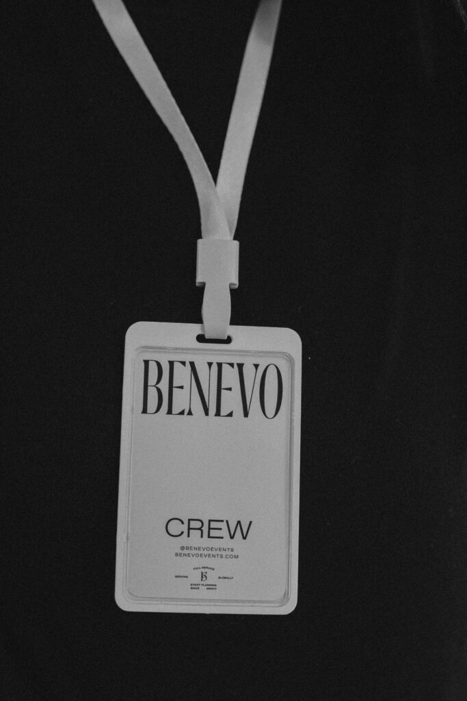
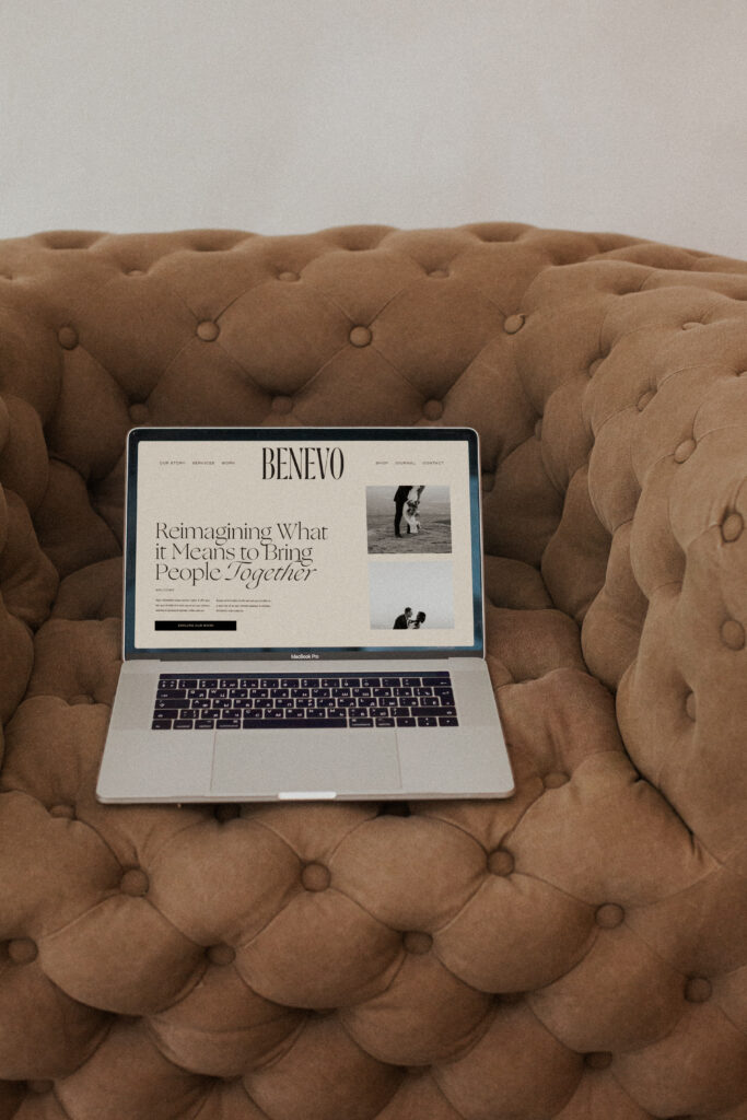
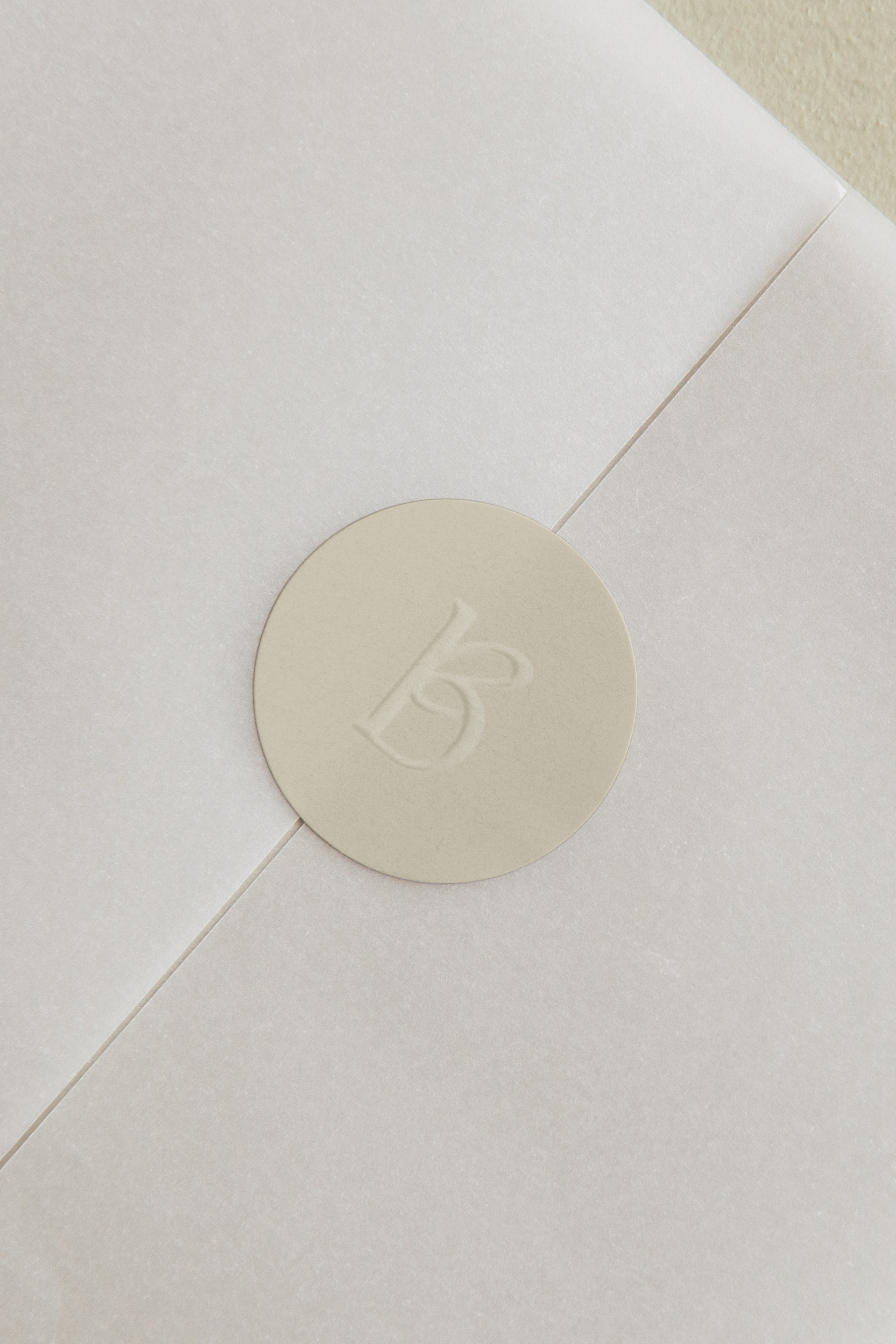
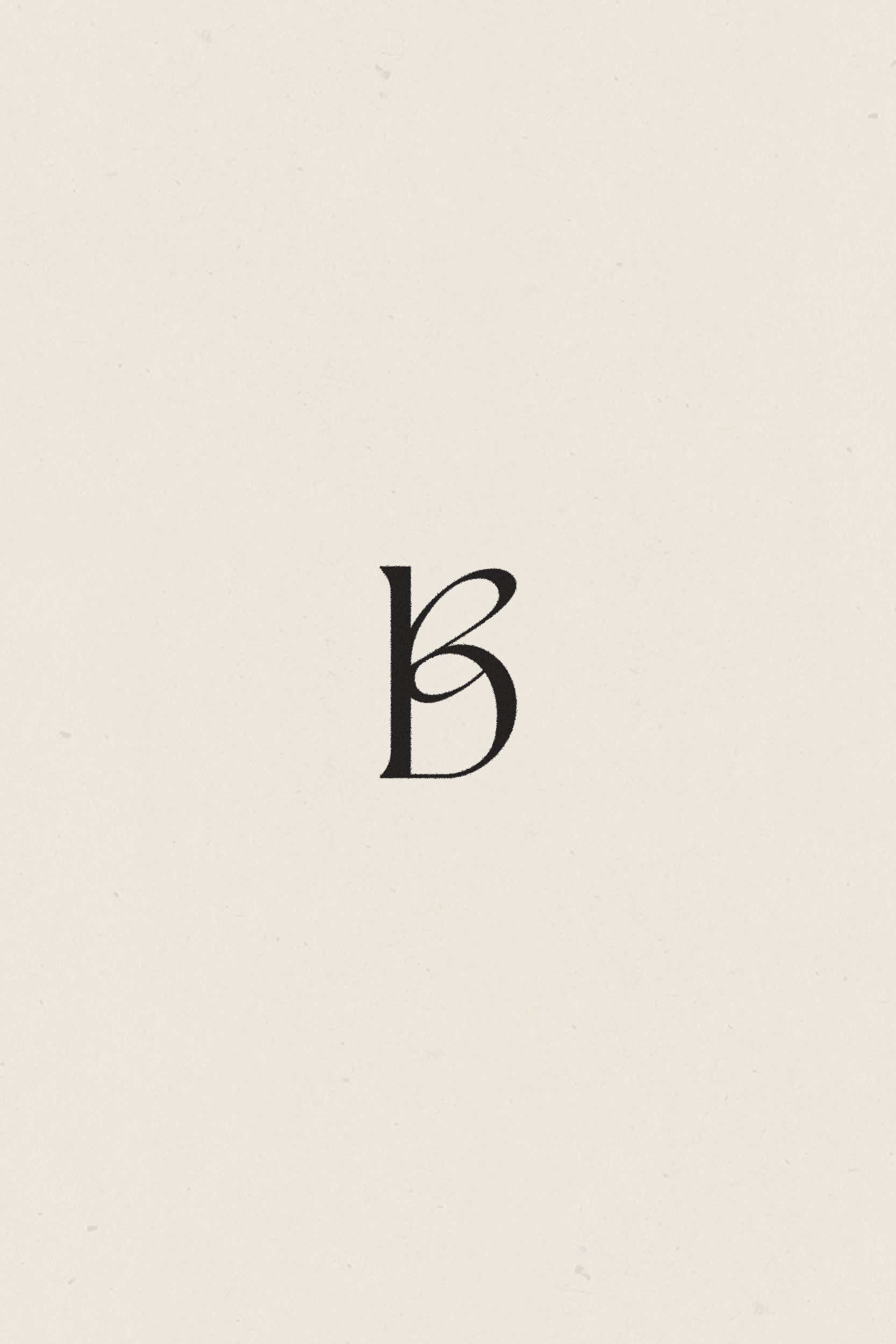
An iconic “B” mark was created from merging “b + e” – the two letters overlap to become one, signifying the unity of two or more beings while the merging of italics and roman fonts create a subtle sense of movement, inspiration, and warmth.
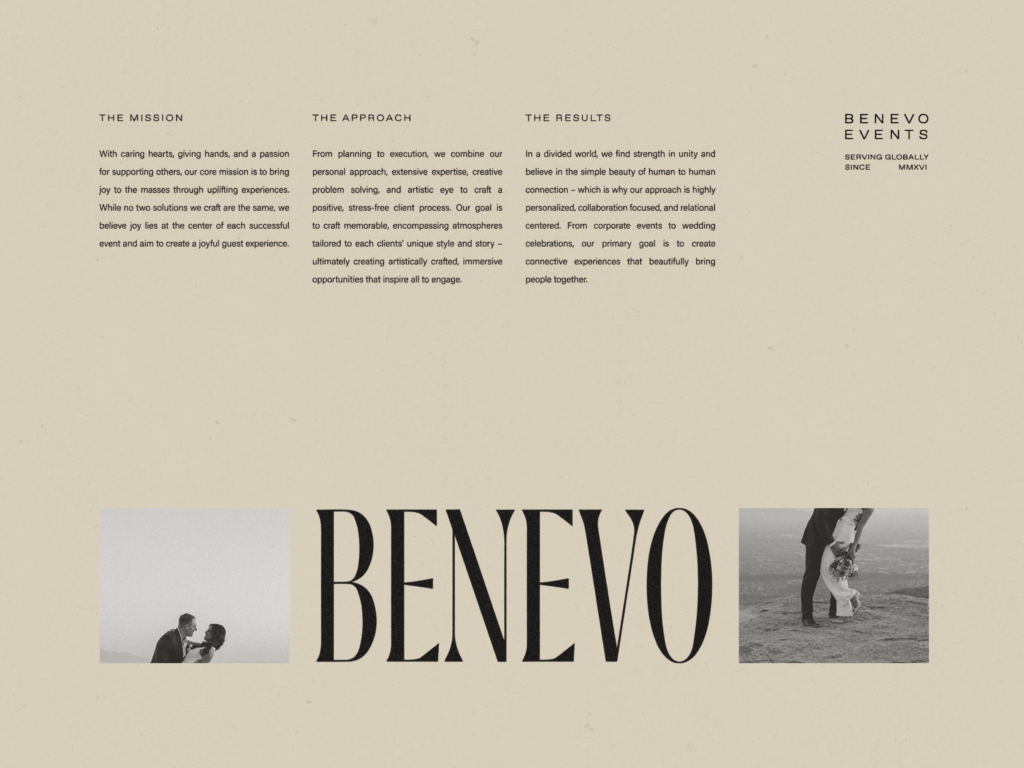
Because their clients trust the Benevo team to guide them through the process from conception to execution, creating a brand that held a sense of strength and confidence was a top priority.
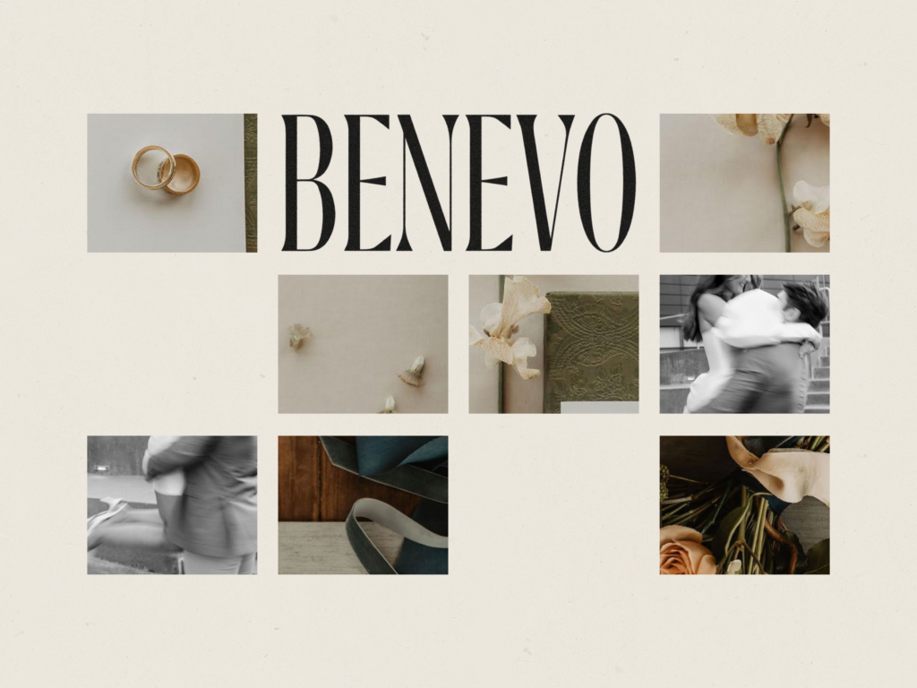
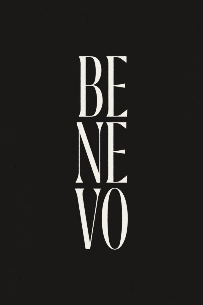
For the primary wordmark, we created a condensed type system to evoke an emboldened feeling of upward confidence, while sharp detailing and thick lettering backbones establish a solid, unwavering foundation.
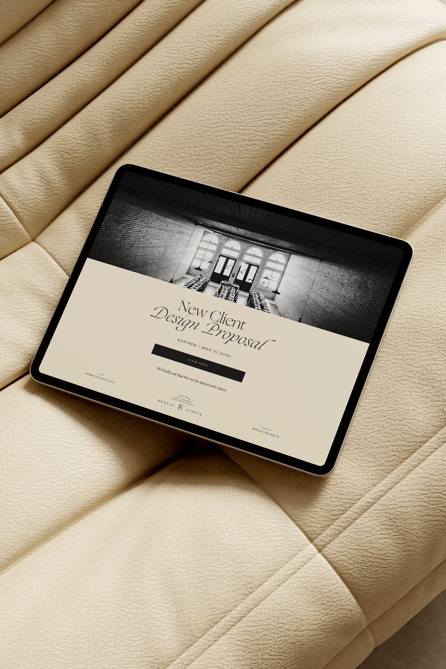
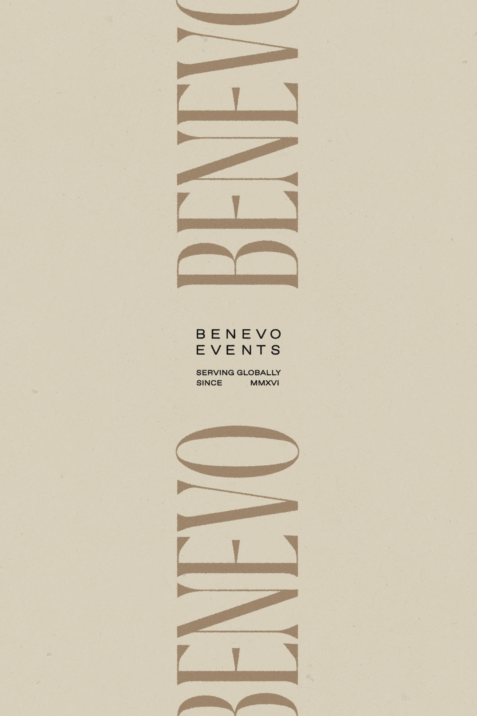
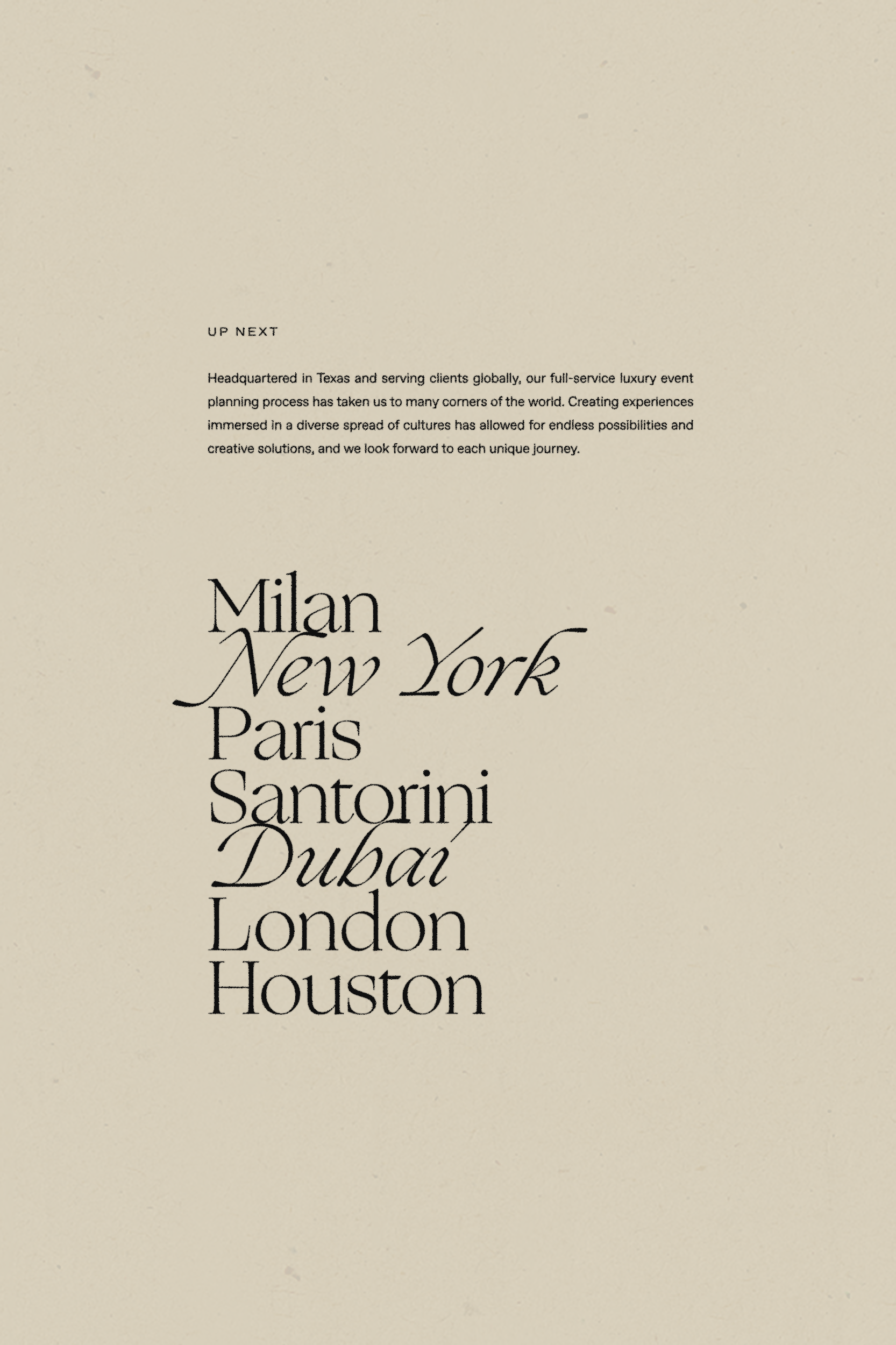
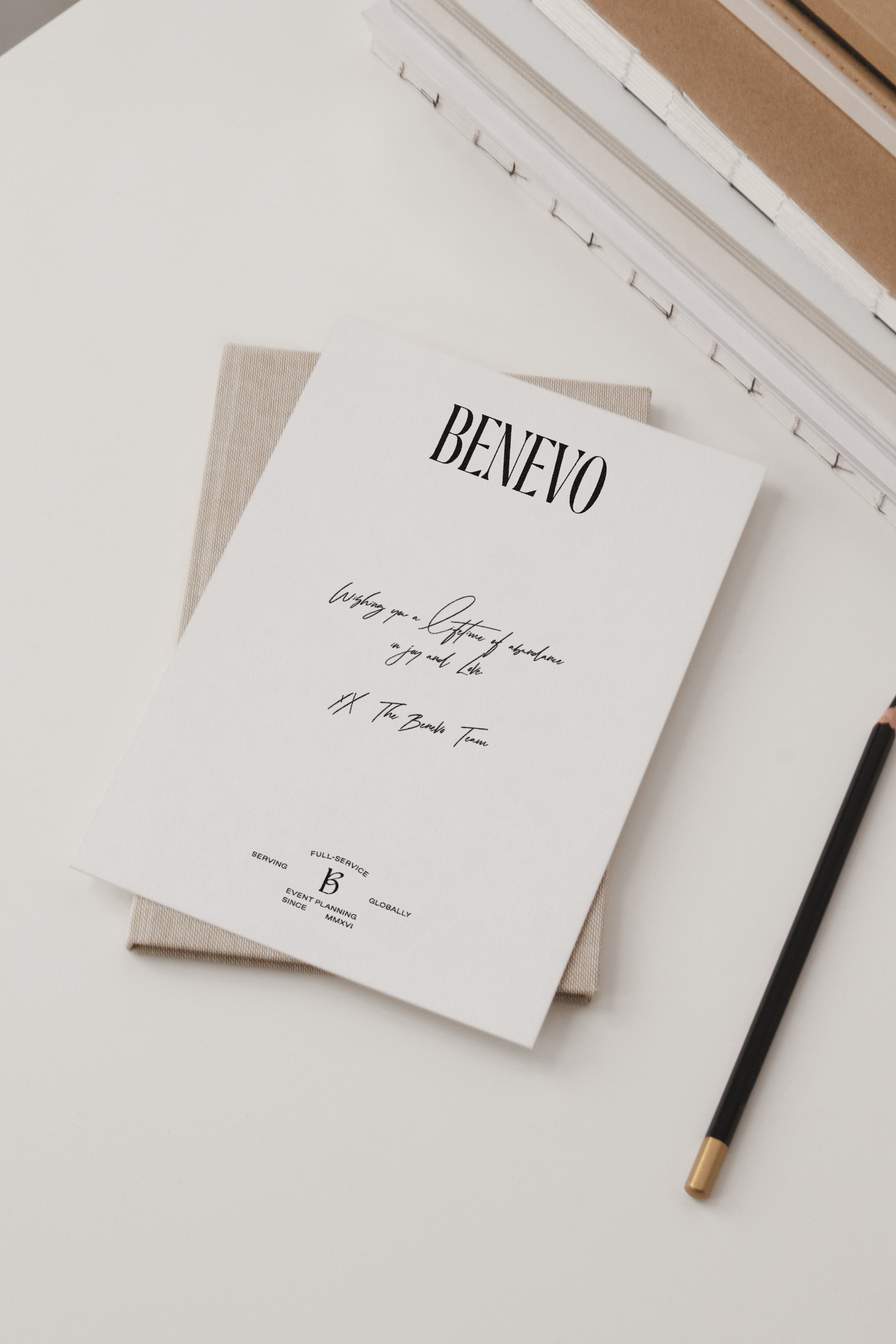
Through editorial-inspired compositions, celebratory messaging, and warm, minimal design elements, we created a brand narrative that reflects their sophisticated solutions, uplifting client experiences, and fiercely supportive nature.